
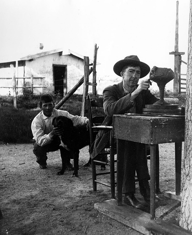
Despite the brevity of his life, Artus Van Briggle, and his Van Briggle Pottery in Colorado, created some of the finest art pottery in the United States during the first four years of the twentieth century (Fig. 1). Van Briggle’s designs were linked by their monochromatic matte glazes, straightforward shapes, and quiet sophistication to arts and crafts movement makers such as Grueby and Teco. However, unlike most American makers, Van Briggle’s forms were closely tied to European design, especially the art nouveau style, which he sometimes specifically mimicked.
Born in Felicity, Ohio, Artus Van Briggle first pursued painting—including study with Frank Duveneck at the Cincinnati Art Academy—but quickly chose ceramics as his mode of expression.1 He attended the World’s Columbian Exposition in Chicago in 1893, where he exhibited a painting, but, more importantly, it was there that he discovered the extraordinary avant-garde art of the French potters. While working for the Avon and Rookwood potteries, Van Briggle’s exceptional talent became apparent. The latter sponsored him for further training in Paris, where he returned to the study of painting under Jean-Paul Laurens and Jean-Joseph Benjamin Constant at the Académie Julian and embraced the imagery and styles of orientalism, symbolism, and art nouveau.
Details of his time in Paris are not well documented, but unlike most American ceramists, Van Briggle enjoyed an opportunity to study sculpture and clay modeling at the Académie des Beaux-Arts in addition to his study of painting. Perhaps more importantly, he gained intimate knowledge of French ceramics, especially the internationally admired pottery emerging from the kilns of Pierre-Adrien Dalpayrat, Auguste Delaherche, Ernest Chaplet, and Jean-Joseph Carriès. Returning to Rookwood in 1896, Van Briggle began experimenting with matte glaze formulations and innovative forms directly influenced by his study and experiences in Paris.
Van Briggle resigned from Rookwood in March 1899. He had contracted tuberculosis, and moved to Colorado Springs in hopes that the dry desert air would improve his condition. There, he set himself up initially to work on pottery in “a corner of the [chemistry] laboratory” at Colorado College, “thanks to the interest and kindly assistance of Professor [William] Strieby.”2 In August 1901 he fired his first pieces at the Van Briggle Pottery on North Nevada Avenue. The international praise Van Briggle had enjoyed for his displays at the Exposition Universelle in Paris in 1900 followed him to his new enterprise and garnered him considerable attention in the design press. Van Briggle Pottery vases were offered for sale in a variety of major American cities, including Boston, New York, Chicago, and San Francisco. The firm showed at the Salon in Paris in 1902 and won two gold, one silver, and twelve bronze medals at the Salon of 1903. But tuberculosis finally won out: the artist’s career was cut short when he died in 1904, at age thirty-five.
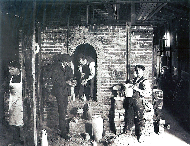
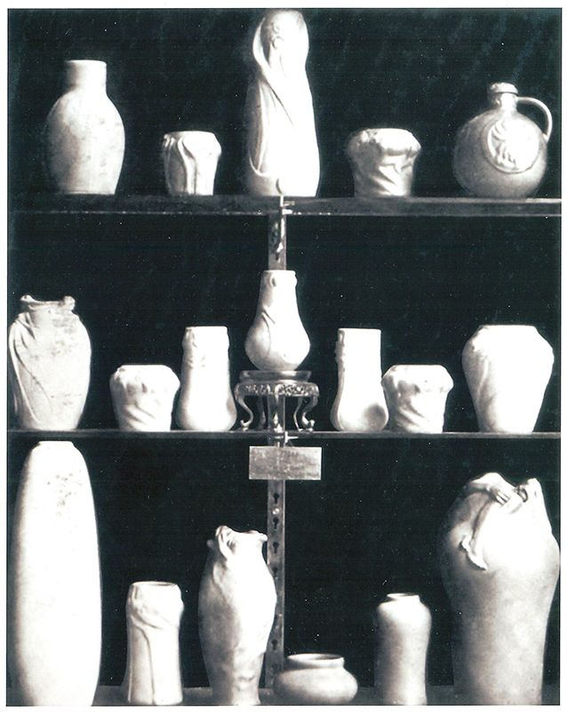
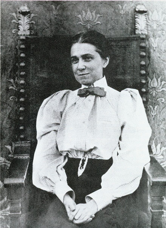
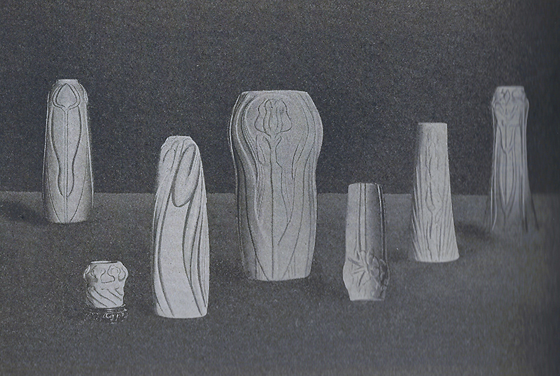
The small pottery Van Briggle established in Colorado Springs was located in a modest workshop building manned by a small staff, including Harry Bangs, another potter from Rookwood (Fig. 4). “Equipped with the most convenient of apparatus and a commodious brickkiln,” Van Briggle could finally “devote himself entirely to the production of his ware.”3 In the fall of 1901, he hosted a small fête to commemorate the initial firings, at which pottery-marked souvenirs were distributed to the assembled guests. As 1902 arrived, more than forty distinct designs were being molded, glazed, and fired, and stock on hand had been built to more than three hundred vases for display and sale to the public.4 There was no question that Van Briggle was the artistic director of the atelier and intimately involved in the execution of the work. Assistants created molds, cast and glazed works, and fired them in the kiln. The pottery had more than ten employees by 1903, with a few more joining in 1904.5 Van Briggle’s workshop functioned as a school for ceramics as well, due to his inability to entice trained potters from the East Coast or Midwest to go to Colorado.6 Van Briggle acted as the primary vase designer but other artists contributed models, notably his fiancée and later wife, Anne Lawrence Gregory (Fig. 12).7 They met when both were students in Paris in 1894, but did not marry until summer 1902. For their Colorado pottery, they developed a mark consistently used on the vases: conjoined As (for Artus and Anne).
European art nouveau clearly shaped certain aspects of Van Briggle’s style, but his connections to the American arts and crafts movement are more complicated. That movement was closely associated with individual artisans and their personal artistic vision, which was at odds with Van Briggle’s commitment to molded ceramics. Glazing and finishing became the key mode of individual expression for Van Briggle, and he went to great effort to rationalize this aspect of his work when he explained in 1903: “It is far more satisfactory to spend unlimited time and thought in carrying out an idea which may be worthy of repetition, each reproduction being different in color and glaze effect, than to attempt for every vase a new design which must of necessity often be careless and hasty in thought and execution.”8 The noted critic Irene Sargent furthered the argument, stating: “the craftsman idea, as carried to its logical conclusion by Mr. Van Briggle, is sound, practical, and altogether free from extravagance.”9
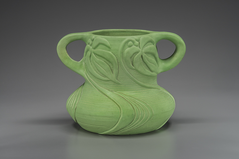
Van Briggle produced molded wares in significant numbers even during his short tenure as head of the pottery from 1901 until his death. (His wife led the enterprise for nearly a decade thereafter.) The firm’s amazing productivity—which extends to the present day—has created a ubiquity in the market that does not enhance understanding of or connoisseurship for Van Briggle vases. Public collections offer little guidance for appreciating the best works, as many feature only typical models—ranging from floral-ornamented designs to the Lorelei and Dos Cabezas vases, both decorated with alluring art nouveau women.10 But in-depth discernment has arguably been scant in many cases in the formation of museum holdings. Here, we will establish an aesthetic framework for evaluating the finest ceramics made at the Van Briggle Pottery.
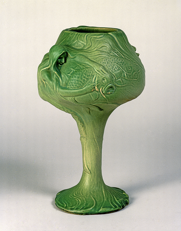
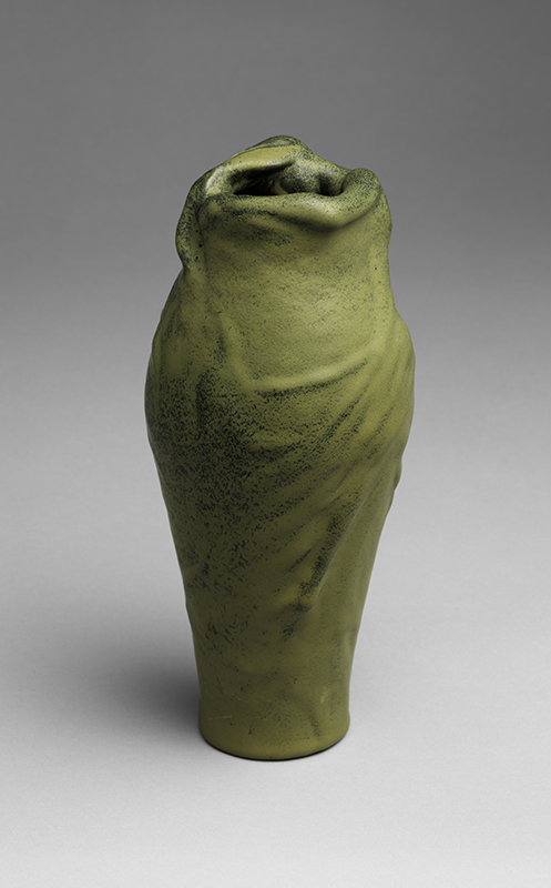
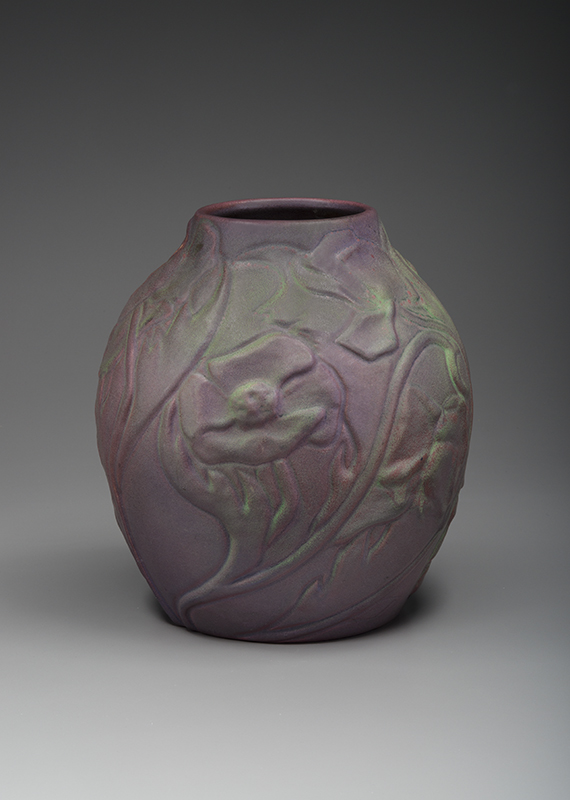
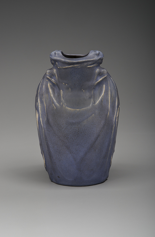
Van Briggle used a simple system for numbering the designs made at the pottery. The very first design, number 1, was a remarkable chalice form developed in 1900. The “Toasting Cup,” as it is known, presents a scene utterly unusual in American and European ceramics (Fig. 2). A long-haired mermaid reaches out toward fishes through a phantasm of underwater vegetation and sea creatures. Her body, hair, fishes and other creatures, and seaweed swirl about the bowl of the chalice forming its shape, and all is set atop a stem and foot shaped as undergrowth and waves. The comprehensive integration from foot to rim of the sensualized symbolist imagery connects this Van Briggle work to contemporaneous candlesticks by Jessie Preston, pieces such as the well-known Squash lamp by Tiffany Studios, and related expressionist European ceramics. It stands as a superb sculptural effort and perhaps the finest expression of Van Briggle’s interpretations of European design. In another series of early figural vases, Van Briggle took on the challenge (virtually unprecedented in American ceramics) of presenting women and men as symbolist motifs more directly. Design number 4 presented the “Lady of the Lilly,” a design featured in critic George Galloway’s October 1901 article in Brush and Pencil. The popular Dos Cabezas vase (design no. 16) incorporated two conventionalized women, and the very next design, number 17, presented a siren in the form of a dramatic but gently sculpted figure gazing down into the vessel around which she and her streaming hair are wrapped (Fig. 3). The Lorelei, as this vase is known, was inspired by the German story of the Lorelei rock. Clemens Brentano created the tale around 1800 in his novel Godwi, and poet Heinrich Heine interpreted the dangerous siren in 1824, spinning a legend of a golden-maned lady of the Loreley on the Rhine River who enticed sailors to their deaths. The tale re-emerged in the 1890s, inspiring musical and theatrical versions that may have been the spark for Van Briggle’s interpretation. The example shown stands out for its fine molding and gorgeous flowing glaze colors and textures. The almost wax-like finish and ethereal atomized—that is, sprayed-on—detailing is an exceptional example of the effect Van Briggle sought at his Colorado pottery and what House and Garden called “finer and richer than the one worked out in Cincinnati.”11
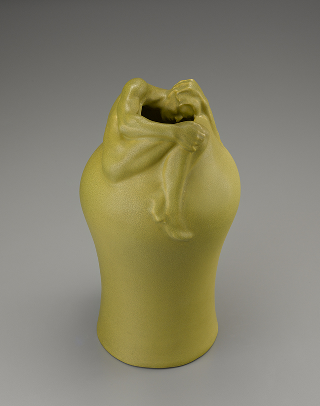
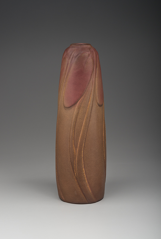
The boldest of Van Briggle’s experiments with figural motifs is surely the Despondency vase—model number 70 (Fig. 6). The Lorelei models expend relatively little detail on the encircling female form; here Van Briggle presents a naked man wrapped around the mouth of an otherwise unornamented form, the figure seeming to peer despairingly into the abyss. The model presented here was made in 1902 and features goldenrod-over-green atomized glaze that, like the previous Lorelei vase, imparts a mysterious sense of time and place. The perfectly controlled glazes diverge from the Lorelei though, with a flawless thoroughgoing evenness in the surface.
Irene Sargent wrote of Van Briggle’s glaze experiments in the Craftsman in September 1903 (Fig. 13). She cited the “examination and thought” spent by the artist and his glaze consultant, the chemist Strieby, and argued that Van Briggle had “reached the conclusion that in principle the modern highly vitrified and bright glazes were inartistic and that, through experiment,” a return “might be made to the soft dull surfaces of early oriental fictiles, to reproduce which would be to restore a lost art.” Sargent pointed to “those pieces coated with the enamel, more or less opaque, known to connoisseurs as céladon, which varies from reddish gray to a sea green ranging from dark to light, and a dull blue of great charm.”12
This range of surfaces was ideally suited to some of the early floral vases developed by Van Briggle. Floral themes are certainly common in period pottery, but Van Briggle’s notably diverge from those of other makers. Rather than naturalism, or even conventionalized approaches to flora, he chose to accentuate formal qualities of plants and flowers—a mode similar to that of European art nouveau design. Like the ceramists at Newcomb Pottery in New Orleans and George Ohr in Biloxi, Mississippi, he tested and experimented with local clays for his early vases. A critic for the Clay-Worker stated plainly that “the clay is Colorado clay, and the decoration in low relief is taken largely from native wild flowers conventionalized.”13 As with the other potteries mentioned, this was likely a conscious expression of the romantic ideal of regionalism. In addition to assistance with glaze chemistry, Strieby was key to Van Briggle’s molding process, helping the artist to understand the properties of indigenous clays and minerals. Strieby and Van Briggle also collaborated with Frank Riddle, another chemist at the pottery, in developing a growing variety of glaze colors and textures.
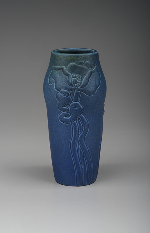
Though he used various wildflowers, Van Briggle also chose more remote classes of plants and flowers, including some that were more closely tied to East or West Coast expressions of the arts and crafts movement. The role of poppy motifs lies somewhere between these options. The artist’s own publicity called attention to the presence of poppies in the western landscape, but of course they are also ubiquitous in European and American design around 1900. The artist created design number 2 in 1900, featuring opened poppy flowers and pods, their serpentine stems elegantly fused to a modest form (Fig. 7). The 1902 version shown here is a perfectly molded example with robust detailing in the flowers and pods and impeccably glazed in vibrant atomized hues of cobalt, azure, and indigo gradated to a powdery green at the rim.14
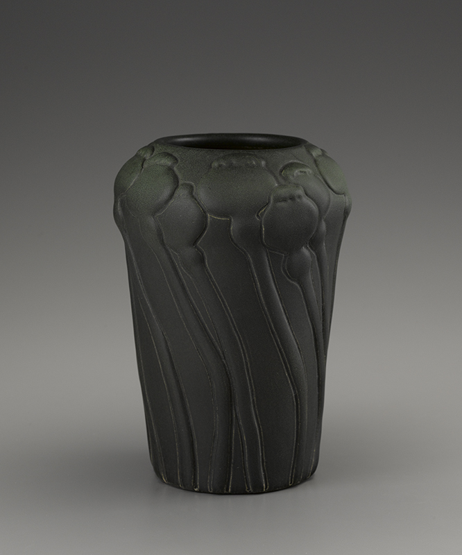
Another vase with poppy decoration, featured on the title page of Clay-Worker in May 1905, stands as the finest floral vase of the early period. Eschewing open flowers entirely, model number 18 shows only poppy pods, each standing with individuated personalities atop meandering stems (Fig. 8). Rather than composed, the pods seem swept up by wind, but are ideally fitted to the shape, which swells toward the top where the pods congregate. The example shown is glazed in a deeply suffused range of atomized black, blue, and green, which rivals the yawningly expansive swaths of matte greens on Grueby pottery. The non-reflective surface texture, rich flat color, and meticulously molded detailing unify the vase, which seems almost like a single carved piece of honed stone. It stands as a high-water mark for matte pottery around 1900. It would be hard to imagine a better example of what critic George Galloway called “quiet and simple effects rather than the loud and garish.”15
For Irene Sargent, the vessel also exemplifies two of the crucial aspects of Van Briggle’s success. She called his decorations “structural,” never “applied or foreign” and emphasized the “lines and contours of the vase,” which the ornament “beautifies.” Sargent also suggested that “beauty resident outside the contour of the piece is provided in part by the glaze; great care being taken to insure an interesting surface, texture and color; the texture varying from a substance ‘fat’ and velvet-like beneath the touch to something approaching a gloss, accented by crystalline or curdled effects.”16 This vase represented Van Briggle Pottery in the exhibition Arts and Crafts Movement in Europe and America, 1880–1920 that toured the United States from 2004 into 2006.
Galloway’s understanding of Van Briggle’s matte glazes is instructive to this day. He called attention to “the difference between the dead finish and the dead glaze,” explaining the dead finish this way: “the biscuit ware is soused in a vessel of glaze, and after withdrawing it, all the glaze which can be removed is taken off with a brush of stiff bristles.” The dead glaze, on the other hand, he wrote, was a “’fat’ solution of glass, which, when applied to the biscuit ware, undergoes a devitrification in the second firing, and the result is a finish which seems to possess the depth and softness of velvet, and which is a constant rest and delight to the eye.” It was “subdued and restful, and at the same time arouses one’s keenest instinct of beauty.”17
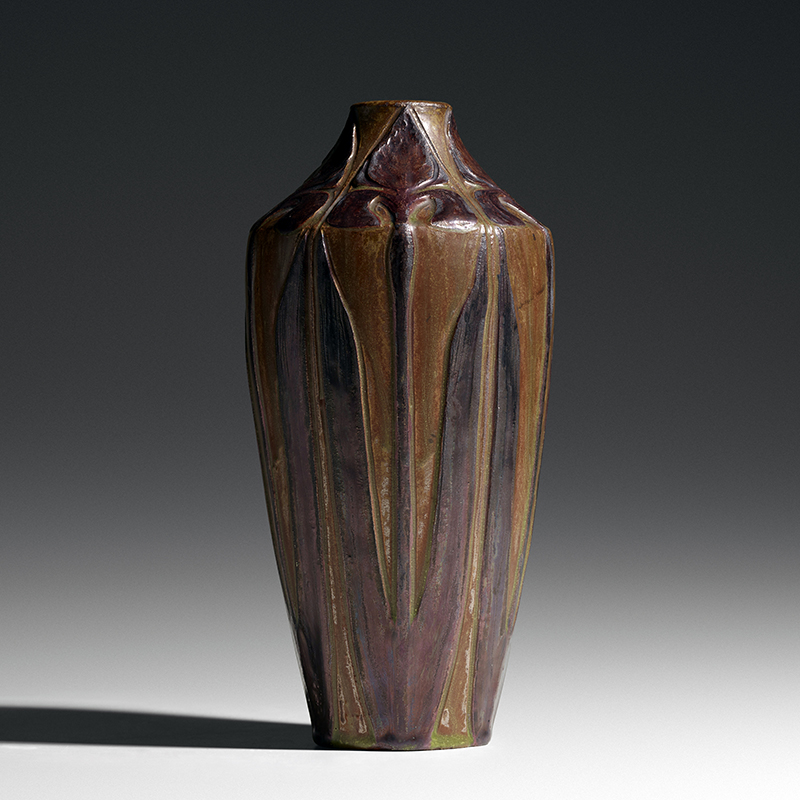
A third poppy model (number 143) diverged significantly from models 2 and 18 in its bold presentation of a swirling tangle of poppies, pods, and stems encircling a large form (Fig. 10). Fitting to the shape and multifaceted ornamental scheme, the example shown here was given a quite atypical surface treatment. Rather than individuating certain aspects of the design with applied colors, Van Briggle chose to give the vase an all-over set of hues and textures. The effect is exquisite as undulations of mauve, purple, and magenta give way to blues and greens. Shape, line, decoration, color, and texture seamlessly interweave in a reverie wild with creative volatility, yet unified in total effect. The colors and textures achieved in this example display the boundaries of atomized glazing. They unite with and hover above the surface of the clay “like a cloud at sunrise [when] the spray issues, and in this iridescent vapor the vase is bathed.” Period accounts describe the ways in which colors were applied, layered one over the other, sometimes as the artist held “the article at an angle to the spray.” One color could be used as a “vignette into another in exquisite blending.” Galloway recounted how even after initial firings, it might be desired “that certain lines be accentuated with darker or lighter tones” so “the glaze is rubbed off in those places and the desired color put in with a brush, but always employing the glaze itself.”18
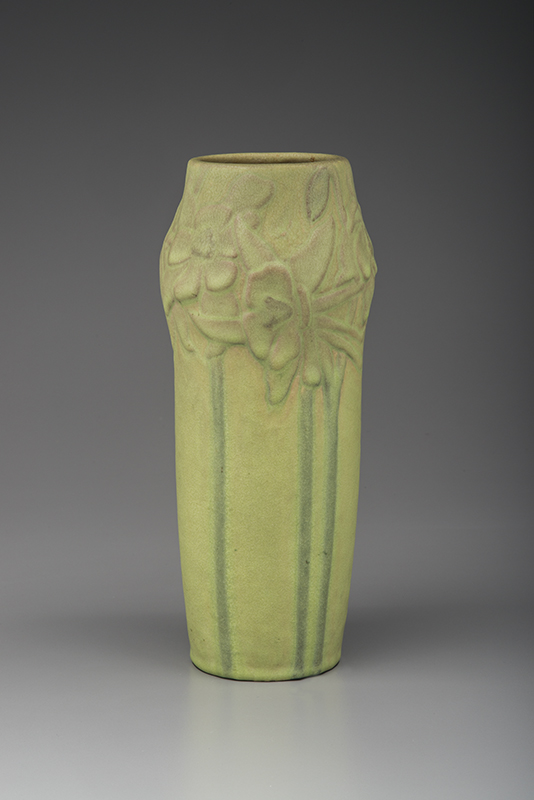
This remarkable effect of highlighting certain features is put to excellent use on a richly polychromed example of model number 25, in which columbines encircle a simple shape with a swollen shoulder (Fig. 9). Here the layering is fascinating: deep rusty reds and pinks effervesce through powdery lime-yellow hues on the blossoms, while the stems are dramatically hand-brushed with vibrant sea or forest green coloration. This important form was illustrated in Keramic Studio in June 1903 and the Craftsman in September 1903.19
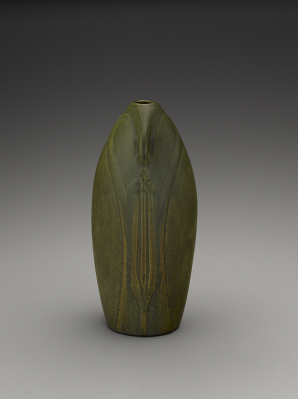
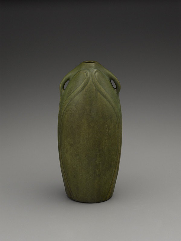
Van Briggle explored leaf and stem imagery rather than flowers in an exceptional design, number 106, which, like the last vase, was twice published in 1903 (Fig. 11).20 One exquisite 1902 version (in a private collection) features a perfect dead matte glaze with deeply suffused greens that rivals the best early vases. The 1903 version shown takes a polychrome track instead, with a complex fusion of brown and yellow coloration for lotus pad stems submerged in water. Atop the tapering form, the lotus pads are a dramatic mauve, orange, and purple. The sophisticated shape of the vase is stylishly fitted with the watery vegetation, but naturalism is secondary as the whiplash curves of the stems and deeply molded edges of the lotus pads directly recall art nouveau designs. Galloway articulated the care taken by Van Briggle in modeling “the formal designs and flowers.” He suggested that each line was “drawn with regard to the contour of the vase as much as to the completion of the design.” Galloway argued that Van Briggle was singularly able to maintain design balance: “the contour of the vase must contribute to the grace of outline, but must not interfere with the harmony of the pattern itself.” 21
The whiplash effect is perhaps even stronger on a handled vase, design number 82, with similarly exaggerated swirling curvilinear stems seemingly descending into water (Fig. 14). The complexity of the molded detail is remarkable, with concentric wave patterns echoing the stem shapes and horizontal striations throughout. The high relief in which the flowers are presented near the rim is nearly without parallel in Van Briggle’s work. The intricacy and refinement of the decoration is paired with strangely crude, almost archaically shaped handles. The combination is resolved only in the angle at which each handle fuses into the curve of a stem. The boldness of the design stands up brilliantly to the audacious lime-chartreuse hues on the 1902 version shown. The flawlessly even color and texture give the vase a sense of being carved from a single piece of stone, or from clay with embedded pigment. Such a multifaceted design is perfectly suited to a single courageous glaze color and texture.
One highly unusual vase of about 1904 features a chic design and intrepid decoration of leaves, stems, and trefoils (Fig. 16). It is unclear whether the motif is to be read as a specific flower form, since the stylization of the elements is so thorough as to obscure direct associations. The detailing is beautifully rendered in the clay, but the glazes steal the show: alternating sumptuous deep purple and aubergine hues with rich earthy greens and browns and gemlike burgundy and iridescent sapphire coloration.
Trefoils are used to very different effect on a tall vase, model number 172, with delicate diminutive handles (Figs. 15, 18). From the front, this shape is decorated only with voluptuous curves that outline the belly of the vase and swirl upward to the breast, where the lines blend into the arcs of the handles. The abdomen features layers and layers of green, brown, and gray atomized onto the clay in a way that mimics polished stone. The sides however, reveal the resolution of the swirling curves flanking a stem-and-two-leaf formation topped with a subtle, fastidiously molded trefoil (likely spiderwort). Underglazes of goldenrod show through the highpoints giving clarity to the molded decoration, but brilliant emerald and intensely suffused pine greens, sometimes pooled in microcrystal formations, give the work a singular unity.
Artus Van Briggle died while his exhibition of pottery at the Louisiana Purchase Exposition in St. Louis was still open to the public. The company draped its display in black fabric until the close of the exposition as a gesture of respect and sadness over the loss of the pottery’s founder. In the fall of 1904, Anne Van Briggle assumed control of the pottery and reorganized the company. She submitted just one vase (of her own design) to the 1905 exhibition at the New York Society of Keramic Arts.22 She continued to lead the Van Briggle pottery operation for several years including oversight of a new building to house the company in 1908.
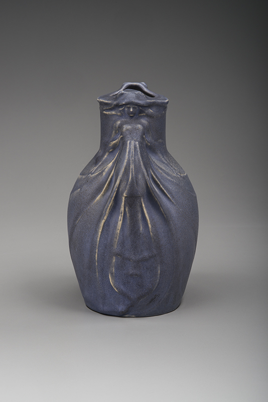
Having mentioned this form earlier, we can return to one of the first designs originated by Artus Van Briggle at his Colorado Springs pottery as a denouement. Model 16, the Dos Cabezas vase, received gorgeous treatment in the first year Anne led the firm (Figs. 17a, b).23 The molding is meticulously articulated down to the individual fingers on the ladies’ hands, and adorned with a frothy lavender glaze with just the right amount of texture to add interest while still revealing every detail of the design. The boldness of the form with its dramatic open-breasted figures returns us to the figural works with which we commenced, but the gentler palette perhaps indicated that a woman was now in charge. As the vision of Artus Van Briggle became more remote from the operation after his death, the quality of forms and glazes fell off. Yet in the space of just four short, glorious years, he created something remarkable in Colorado Springs.
1 For historical information on Artus Van Briggle and the pottery, see Van Briggle Pottery: The Early Years, ed. Barbara M. Arnest (Colorado Springs, CO: Colorado Springs Fine Arts Center, 1975); and George D. Galloway, “The Van Briggle Pottery,” Brush and Pencil, vol. 9, no. 1 (October 1901), pp. 1–8, 11. 2 “Van Briggle Pottery: One of the Latest American Ceramic Products to Gain World-Wide Fame,” The Clay-Worker, vol. 43, no. 5 (May 1905), p. 646. 3 Galloway, “The Van Briggle Pottery,” p. 2. 4 See Scott H. Nelson, et al., A Collector’s Guide to Van Briggle Pottery (Indiana, PA: Halldin, 1986), pp. 145–146. Information on number of works available in late 1901 can be found in Van Briggle Pottery, The Early Years, p. 16. 5 “A Colorado Industry,” House and Garden, vol. 4, no. 4 (October 1903), p. 166; see also Irene Sargent, “Chinese Pots and Modern Faience,” Craftsman, vol. 4, no. 6 (September 1903), p. 423. 6 A Colorado Industry,” p. 166. 7 Anne Gregory and George Bowyer Young were both mentioned as designers in the early period before Artus Van Briggle’s death in 1904; see ibid., p. 168; Klara Ruge, “Kunst und Kunstgewerbe auf der Weltausstellung zu St. Louis (II.),” Kunst und Kunsthandwerk, vol. 7 (1904), p. 634. 8 “A Colorado Industry,” p. 168; see also Sargent, “Chinese Pots and Modern Faience,” pp. 421–424. 9 Ibid., pp., 422–423. 10 One exception is the Metropolitan Museum of Art, which has a fine collection of Van Briggle works. 11 “A Colorado Industry,” p. 165; see also Van Briggle Pottery, The Early Years. 12 Sargent, “Chinese Pots and Modern Faience,” pp. 418–419. 13 “Van Briggle Pottery: One of the Latest American Ceramic Products to Gain World-Wide Fame,” p. 645. 14 Another exceptional version of this model, also made in 1902 and in a private collection, features a bold polychrome set of glazes. The texture of those colors is milky bordering on opaque and though they are carefully applied, the viscosity obscures some of the details in the molding. Similarly the naturalism of the three-color approach creates an odd effect where neither the green of the stems nor the purple of the flowers rings true with nature. 15 Galloway, “The Van Briggle Pottery,” p. 2. 16 Sargent, “Chinese Pots and Modern Faience,” p. 424. 17 Galloway, “The Van Briggle Pottery,” pp. 2–4. 18 Ibid., pp. 5, 7, 8. 19 “Pottery at the Arts and Crafts Exhibit: Craftsman Building, Syracuse,” Keramic Studio, vol. 5, no. 2 (June 1903), p. 37; Sargent, “Chinese Pots and Modern Faience,” facing p. 415. A superb other example of this form, also executed in 1902, featuring an overall even glaze of brilliant lime green and fine powdery dead glaze texture is in the Los Angeles County Museum of Art. 20 Sargent, “Chinese Pots and Modern Faience,” facing p. 415; I. H. W. “General Arts Notes,” Fine Arts Journal, vol. 14, no. 6 (June 1903), pp. 236–237. 21 Galloway, “The Van Briggle Pottery,” pp. 5–6. 22 The Arts of the Fire: Exhibition at the National Arts Club, April 19 to May 10, 1905 (New York: New York Society of Keramic Arts, 1905), p. 24, no. 139. 23 It is widely acknowledged that the Dos Cabezas (Two Heads) vase was designed by Artus Van Briggle, based directly on a nearly identical metal vase likely made in France; see Martin Eidelberg, “Myths of Style and Nationalism: American Art Pottery at the Turn of the Century,” Journal of Propaganda Arts, vol. 20 (1994), pp. 103–104.