While booth design may be a secondary consideration for some exhibitors at the Winter Antiques Show, every year a handful make a splash. Among these, the designs of the New York-based interior designer and architectural historian Ralph Harvard have come to be the most anticipated of the show. We recently caught up with Harvard and asked him to talk about his inspired installations:
How did you get involved in designing booths for Elle Shushan and Sumpter Priddy III for the Winter Antiques Show?
Sumpter and I went to the University of Virginia School of Architecture together many years ago, and I have traded thoughts and observations and insults with him for over twenty-five years. The first booth I did for him was very flashy, so that the little southern country boy would get noticed; it had carefully handmade hand-block-printed paper in vivid bright blue, hot pink, black, and white. We were able to buy it as an overrun from the wallpaper produced for the newly refinished George Wythe House in Williamsburg, Virginia, so the paper had an excellent regional and colonial association.
Ten years ago, Elle required a similar introduction, as few folks even notice miniatures because of their diminutive nature. We executed a bright yellow “print room” for her, imitating the eighteenth-century practice of gluing prints directly to the walls, and ever since I have followed themes that she presents me with each year.
Elle picks a historical room that relates to a piece she has for the show, or to the loan exhibit, and we interpret it in a way that will be enticing and eye-catching. Elle’s a bit of a fretter, so Pat Sykes from my office and I tend to keep her in the dark as much as possible. The short and pressured process of installing booths at the armory can be harrowing. Pat’s long relationships with the union guys at the armory make our installations more than pleasurable, and she has been known to bake brownies and cookies for the electricians, who are always available to install our lights!

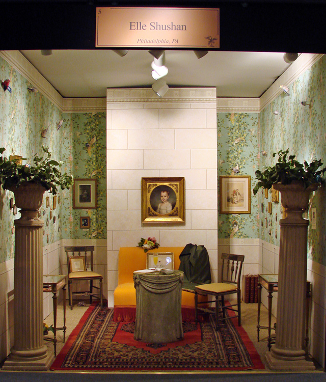
This year Elle’s booth replicated Empress Josephine’s palace at Malmaison. What inspired this design?
We worked from a painting, Francois Gerard’s Portrait of Josephine (1801), which depicts the empress on the open terrace of the palace at Malmaison. Josephine is shown relaxing on an apricot-colored banquette, adjacent to a stone wall, and above the wall a glorious garden is flanked by columns. Usually, we have to construct some walls or moldings for each booth, but unlike past years, we realized we could “paint” the entire scene with wallpaper.
For the architecture and walls, which always come first, we used a great block paper from Old World Weavers with a stone wall design, and a cornice and chair rail from Carleton V. Brunschwig and Fils has a lovely soft garden-trellis paper (Villa Poppaea) that while somewhat based on early nineteenth century examples, is honestly twentieth century in its softer colors and faded impression. Then we added a couple of columns and a superb columnar cement table loaned from dealer Barbara Israel.
A “catalogue” banquette was slipcovered in apricot velvet, and, just as in the painting, a green damask throw was laid across the side. Elle then added the miniatures, which she tied to the walls with apricot ribbon, though it appeared they are tied to the vines and trees. We always try to add a bit of whimsy, so this year my fourteen year-old daughter made life-like paper birds to perch in the wallpaper branches, adding a jolting three-dimensional quality to the flat walls.

While less theatrical, Sumpter’s booth still has the feeling of a constructed room. What were some of your considerations here?
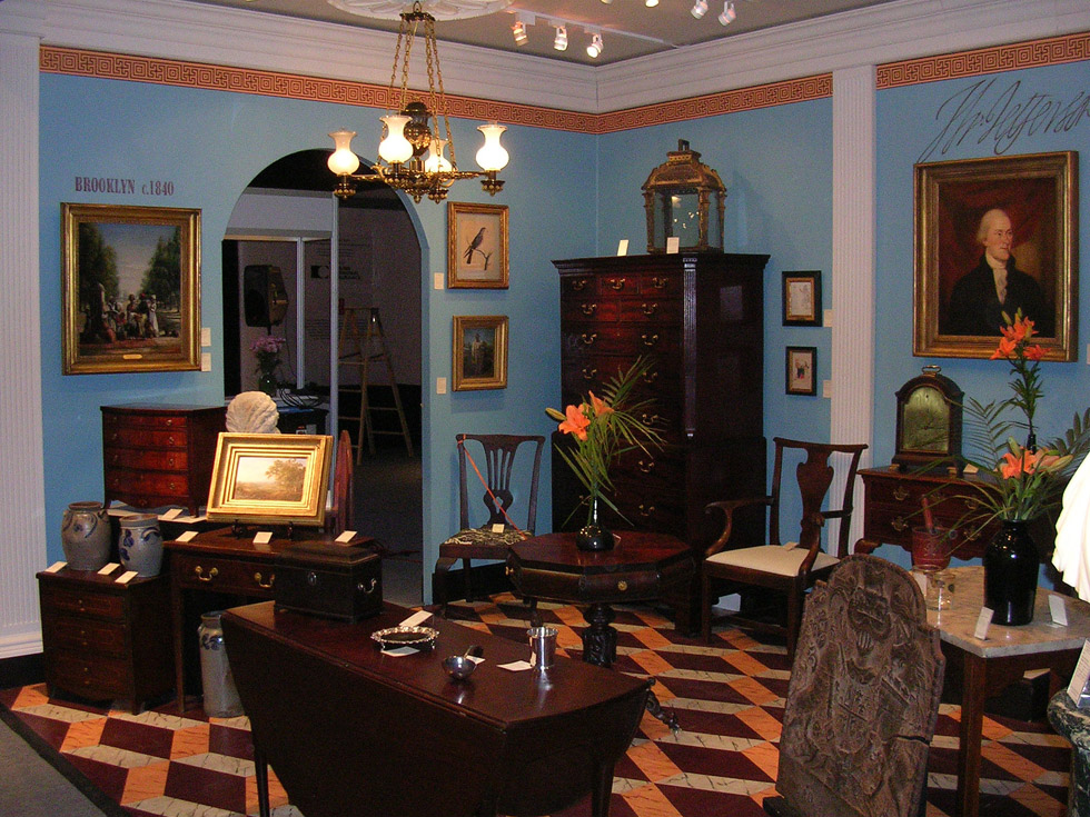
Every year in Sumpter’s booth we use the same strong architectural moldings: beefy cornice, big base, and fluted pilasters, to define the prominent corner space, so there is always a good solid backdrop for his furniture and pictures. We also usually cut a half-round arch in one wall to break up all the straight lines. Each show, it is paint that makes the difference in his booth – and of course the antiques, which are much more prominent than in Elle’s. This year we chose “Elizabeth Street Blue” from the Colors of Historic Charleston paint collection by Duron. Azure blue, a personal favorite, works well with gilt frames and brown furniture if warmed up with a complimentary color, as they did in the period, so we chose a burnt bright orange for the border at the cornice and for one of the three colors in the floor.
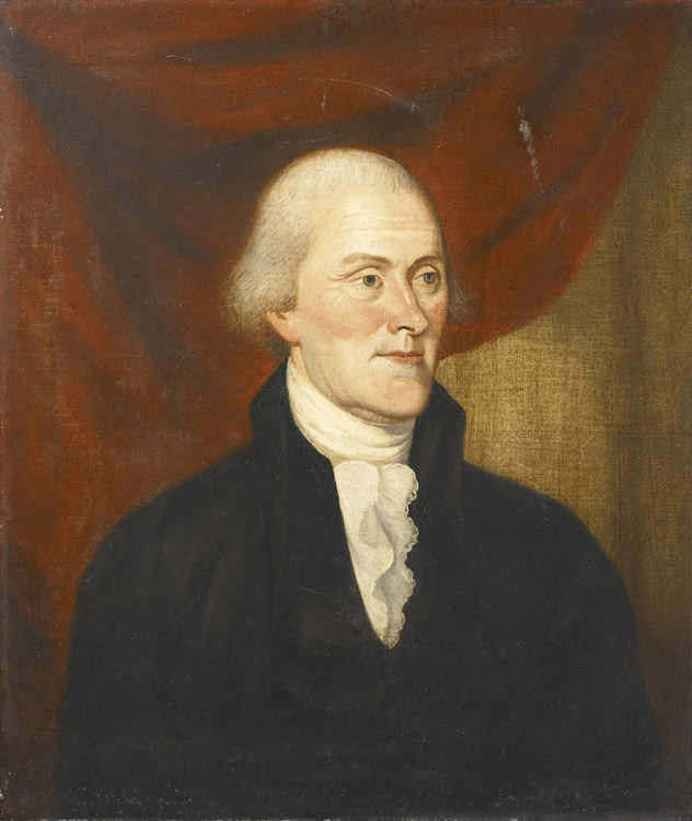
Since the walls are plain, we accented the floors in a “marbled” floorcloth pattern, painted directly to sheets of plywood and installed on the floor. The cartoon marbling and geometric pattern copies nineteenth-century floorcloths, which in turn copy stone and marble floors – usually Italian. Since this year Sumpter was showing a wildly important life portrait of President Thomas Jefferson (who founded The University from which we both graduated!) we painted his signature boldly above the painting right on the wall.

From all of your past designs for the Winter Antiques Show, do you have a favorite that you could tell us about?
My preference is for what might be called “Cavalier Baroque Style”; that’s my term for the first half of the eighteenth century in Virginia, where and when the best of colonial architecture was produced. Elle of course sells miniatures, which tend to date from the early nineteenth century, a period for which I have little passion. But two years ago, the loan exhibit was from the Museum of Early Southern Decorative Arts, and Elle reluctantly agree to let me chose a design that would be sympathetic to the South. Well, among my favorite houses is Westover, built by William Byrd about 1750 on the James River, and non-arguably America’s finest Georgian house (as former president of the American Georgian Group, I can say that with authority!).
I drew up three elevations of the principle drawing room with its pilasters and black marble mantle, and had them blown up full size and printed on scrims, which we hung on the walls to re-create the exact room. Paint analysis shows the parlor to have originally been painted a deep oxblood red, but we realized we could only lightly wash the walls with red, as the dark color obscured the drawings. Our red became pink, and the contrast between the prissy near-fuchsia color and the severe black-line architectonic drawings was dazzling.
