

The Bridge by Hart Crane, with illustrations by sculptor Joel Shapiro, 2017.

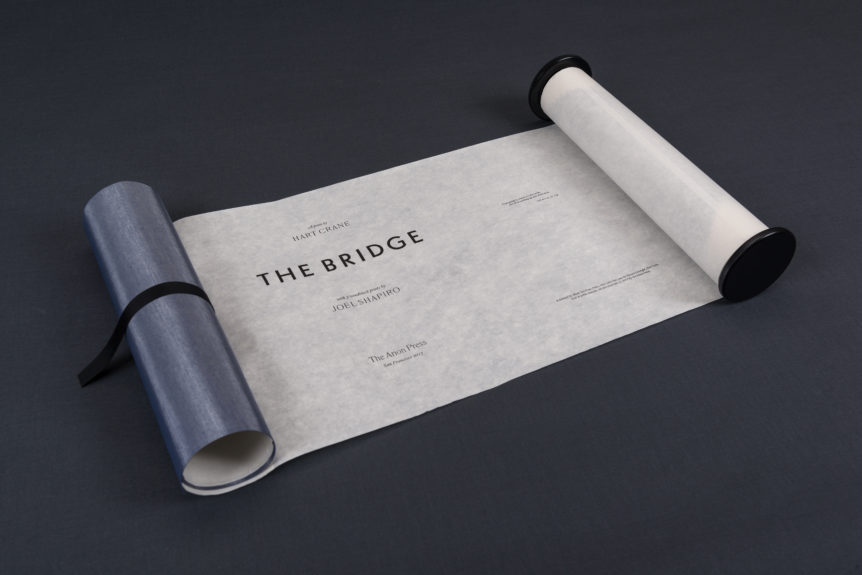
Arion's edition of The Bridge is presented in one continuous scroll.
You would expect Arion Press, the preeminent publisher of limited-edition books for more than forty years, to have arrived at a signature style and format. And it has . . . by refusing to do so. The trim size, paper, binding, type, layout, and illustrations in Arion’s more than one hundred books are so wonderfully various, it’s as if founder and publisher Andrew Hoyem and his collaborators had early on decided that literature’s diversity would not/could not be reduced, simplified, or rendered predictable. (How un-American . . . or how very American, depending on your point of view.) This has left the press free to design and publish Ulysses (with drawings by Robert Motherwell), Lawrence Ferlinghetti’s A Coney Island of the Mind (with a portrait of the poet by R. B. Kitaj), and Ludwig Wittgenstein’s On Certainty (with prints by Mel Bochner), among many other titles, in a spirit that accords with Arion’s own sense of those texts. Many of the books come with elegant introductions by notable experts: Helen Vendler on the poems of Wallace Stevens, for instance; Arthur Danto on Wittgenstein. An edition can occasionally run as few as seventy-five copies; the price is determined by such variables as the costs of production.

Cane by Jean Toomer, with an afterword by Leon Litwack and ten woodblock prints by Martin Puryear, 2000.

The wooden slipcase for Cane.
Very few of Arion’s books, notably Moby-Dick with a hundred wood engravings by Barry Moser and Gertrude Stein’s The World Is Round, were issued in trade editions and thus available to the general public. Arion’s limited edition of Stein’s story is an interesting example of the lengths to which the press may go: it includes the illustrations Stein commissioned from Clement Hurd (illustrator of The Runaway Bunny and Goodnight Moon), but it is actually round, nine inches in diameter. It came in a rose and blue gift box with a square forty-eight-page companion volume, The World Is Not Flat, by Hurd’s wife, Edith Thacher Hurd, describing how the book came about. A round book accompanied by an explanatory volume by the illustrator’s wife and issued in four hundred copies. That’s the kind of thing they do at Arion . . . or one kind of thing.


The World Is Round by Gertrude Stein, with pictures by Clement Hurd, 1986.
Which brings us to Hart Crane’s The Bridge, recently issued by Arion with seven woodblock prints by Joel Shapiro and two photographs by Michael Kenna in an edition neither square, round, nor rectangular—unless you consider its format, a scroll of some fifty feet, to be a very long rectangle, or the cloth-covered box it comes in, which is, of course, rectangular, or the addition of the introduction by Langdon Hammer printed separately in folio format and housed in the box with the poem. The long poem is printed on handmade paper imported from China in ten- and sixteen-point French Elzevir type, hand set by Andrew Hoyem. Why a scroll housed in a box? Why not? Almost no one has known what to do with Crane’s great work. It exasperated contemporary critics like Allen Tate, who accounted its effort to create an overarching myth for America a noble failure when The Bridge appeared in 1930; it baffles most readers with its archaic diction, jump cuts of images from the Brooklyn Bridge to vaudeville to Cape Hatteras, its references both historical and obscure. The poem’s often undisciplined intensity, not to mention its reputation as the work of a homosexual poet in love with drink, has kept many others away.

Seven of Joel Shapiro's woodblock prints illustrate The Bridge.
But The Bridge is loved by those of us who submit to it as to the intoxication of any poetry that communicates before it is understood, sensing that, as Harold Bloom has said, Crane “writes each lyric in such a way that you literally feel he’s going to die if he can’t bring it off.” It is rhapsodic, sexy, jazzy, and just that urgent. In the unlikely event that you have read and remembered all of world literature, as Harold Bloom has, you will know where many of the lines and images come from—whether Crane plucked them from the Book of Isaiah, Whitman’s Leaves of Grass, his own ramblings from Brooklyn to the Gulf of Mexico, or his discussions with his friend Walker Evans, whose photographs of the Brooklyn Bridge capture the kind of symbolic power the structure held for Crane. On iTunes you can find Bloom reading and interpreting the poem in his powerful and thrilling way. The excellent introduction to this edition by Langdon Hammer of Yale University ought to be made available to people beyond those few who will be able to buy one of the three hundred or so copies. But failing that, follow Hammer’s advice and simply read The Bridge: “There is no way to understand the poem by standing outside it. . . . The reader must simply dive in and learn its language, which is difficult but not private.”

One section of The Bridge's scroll.
Quite true, but how then was an artist to “illustrate” this edition? “You can’t illustrate a poem,” Joel Shapiro replied when I asked him. That was my first hint that Shapiro was the right man for the job. The enormous appeal of his sculpture seems to me to come from the way in which it collapses the distance between the work and the viewer who just “dives in” and is rewarded. Then, too, Shapiro appreciates Crane’s poem, enjoys Tennessee Williams’s reading of it online, and he knows the Brooklyn Bridge as well, having lived with a good view of it from an apartment on Gold Street in Lower Manhattan several decades ago. So what then did he have in mind when Andrew Hoyem suggested this project? “I just wanted to throw some ink around,” he told me. Pretty much what the poet himself did, I replied appreciatively. “Yes,” he added later, “it’s about sex and rapture,” so that approach seemed appropriate. Hoyem was not so sure, arguing instead for something more firmly tied to cables, arches, beams, and water. Shapiro resolved the matter by embarking on a set of cunning and handsome woodcuts that make deft though oblique references to the poem. The text panels, 25 inches wide by 13 1/2 inches tall, are interrupted by these woodblock prints, each of which occupies its own panel.
And so, a one-off in American letters, Hart Crane’s The Bridge, has found its objective correlative in Arion Press’s edition, a horizontal scroll fifty feet in length punctuated by images that beckon seductively, inviting readers to dive in.

Ulysses by James Joyce, with forty etchings, of which twenty are in color, by Robert Motherwell, 1988.

Ulysses by James Joyce, with forty etchings, of which twenty are in color, by Robert Motherwell, 1988.

A Coney Island of the Mind, poems by Lawrence Ferlinghetti with portraiture by R. B. Kitaj, 2005.

A Coney Island of the Mind, poems by Lawrence Ferlinghetti with portraiture by R. B. Kitaj, 2005.

A Coney Island of the Mind, poems by Lawrence Ferlinghetti with portraiture by R. B. Kitaj, 2005.

Sampler, two hundred poems by Emily Dickinson, with 206 original prints by Kiki Smith, 2007.

Sampler, two hundred poems by Emily Dickinson, with 206 original prints by Kiki Smith, 2007.

Moby Dick, or The Whale by Herman Melville, illustrated with one hundred wood engravings by Barry Moser, 1979.

Moby Dick, or The Whale by Herman Melville, illustrated with one hundred wood engravings by Barry Moser, 1979.

Porgy & Bess, the libretto by DoBose Heyward and Ira Gershwin, with twenty lithographs by Kara Walker, sixteen of which are bound in the book and four in a separate portfolio, 2013.

Porgy & Bess, the libretto by DoBose Heyward and Ira Gershwin, with twenty lithographs by Kara Walker, sixteen of which are bound in the book and four in a separate portfolio, 2013.