
Serious collectors of both fine and decorative art have been rare in the past century. I posed this paradox to an audience at a Chipstone Foundation conference well over a decade ago and find myself thinking about it again as the The Magazine ANTIQUES turns one hundred. My focus back then was the challenge of hanging major paintings in the context of rigorous and thoroughgoing interiors of architectural or design significance— for example, the notion of hanging a Manet portrait in a Prairie style room by Frank Lloyd Wright. Yet, even when masterpieces of art and design are chronologically or stylistically matched, there can often be a fundamental disagreement between great works from the two categories.
I am not thinking of cases like a collector of French or British paintings who decorates with related furnishings, or of collectors who simply match their Andy Warhols and Agnes Martins to the chic modern aesthetics of designers such as Zaha Hadid and Mark Newson, nor of assemblages of period harmony. What I analyze here are differentiated collections of art and design where clear vision, consummate discernment, and ultimate quality are achieved within the minds and hearts of single collectors. Ironically, it may be the disinterest in making pleasing interiors that informs one type of collector. He or she has the boldness to collect art and design at the highest level without regard to immediately discernable harmony between the two.
The collection of art and design with which my husband and I live, I believe, offers lessons in ways that art and objects can come together with resonance and provocation. Our home is a superb Mellor and Meigs Norman-Tudor masterpiece with circa 1900 furniture, lighting, metalwork, and ceramics that this publication has called “unparalleled.” We welcome carefully selected works as early as a canvas by Paul Cézanne and as recent as works made in the past five years. The point here is to interrogate the mindset of gathering these works of art and design and the often-unexpected relationships and crossfertilizations that occur when vision widens to accommodate rigorous collecting of art and design.
Here are some cases in point from our collection:
People and other enigmas
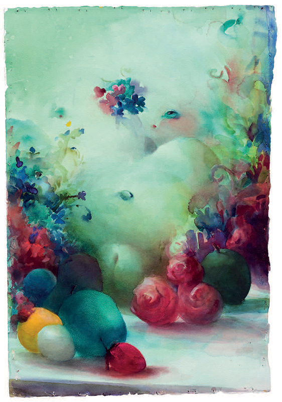
The art of Lisa Yuskavage is fundamentally about beauty, but it is a strange, fantastical world that her subjects inhabit. The women in her paintings and watercolors wear as little as they choose, pose as provocatively as they like, and engage in whatever activities amuse them. This feminist ideal of radical liberation is always tempered with a kind of old-fashioned gorgeousness that borders on lurid. Her aggressive palette, fecund female forms, and big plump flower blossoms present themselves like over-ripened fruit, intentionally skirting along the boundaries of what we might alternatively interpret as exquisite or gaudy.
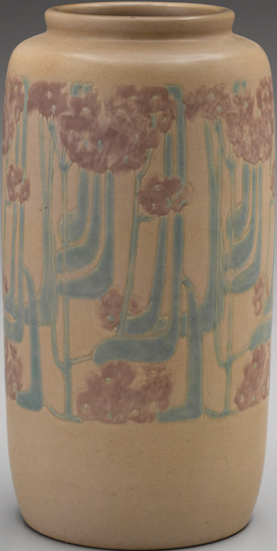
Perhaps with much less self-awareness, the wellknown Rookwood Pottery in Cincinnati traced a similar path along the edges of sublime and vulgar expression in their matte glaze vases around 1900. In one vase by Harriet Wilcox, a nearly desperate desire to layer multiple blossoms onto a single swollen form results in a kind of excess that portends the multiplicity of blossoms and balls that envelope Yuskavage’s nude subject in Tit Heaven no. 14 (Figs. 1, 2). The hues of crimson, peach, mauve, indigo, and green in the vase are edgy and brilliantly regulated by Wilcox, but the trembling energy of their interactions against the mint-green field are nearly too much for even her to control. The glazed decoration celebrates the naturalism of asymmetric leaf formations and blossoms, while Yuskavage tightly composes her tableau, spraying buds and fully formed flowers alongside her reclining figure. Blurred edges and subtle gradations of hue and saturation give a kind of fleshy softness to both the ceramic and watercolor works, furthering the hazy, fanciful visions of prettiness created by each artist. Taken together, these works reveal much about how we as viewers take an active role in construing beauty.
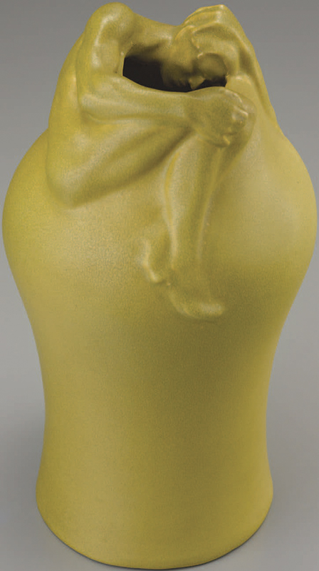
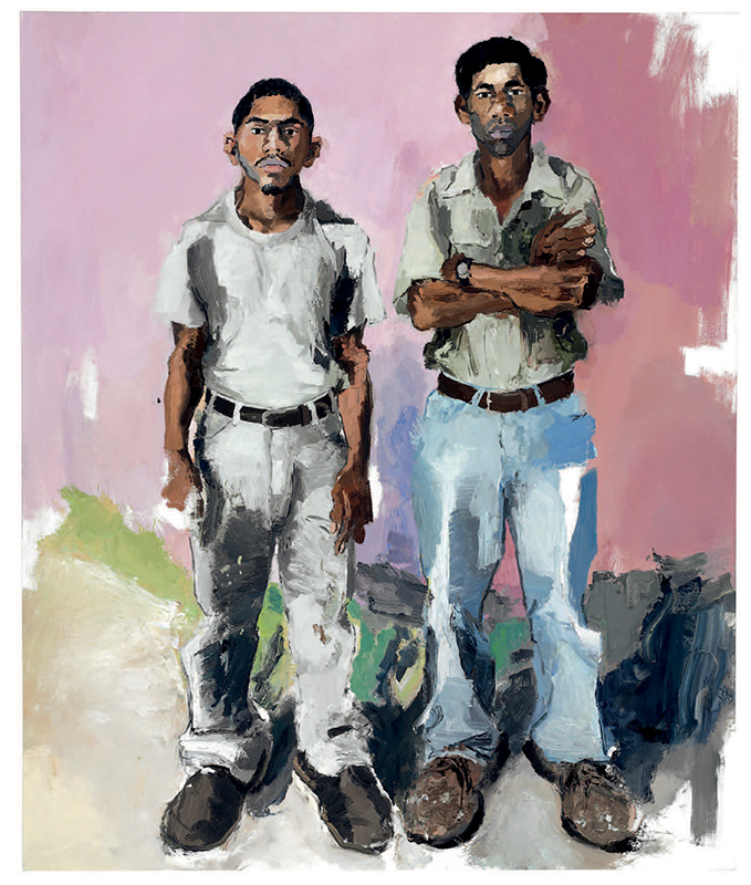
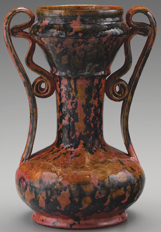
Similarly, a most unusual link arises between a monochromatic Van Briggle vase from 1902 and a brilliantly hued painting from over one hundred years later. Both works present the revelatory and quite subversive presentation of men as the subject of the artists’ gaze. Artus Van Briggle’s bold decision to curl a naked male subject around the mouth of his Despondency vase stands as an audacious move in the history of American design (Fig. 3). Though naked women had been fodder for paintings and ceramics seemingly forever, his despairing naked man stands as a milestone: it is among the only such depictions to that date in the history of American art. John Sonsini made a similarly provocative move in choosing as his subject, for the bulk of his painting career, the migrant workers he lovingly portrays (Fig. 4). His subjects are rarely posed with more than a wall as backdrop, leaving their personalities and reactions to being painted (from intrigued, to resigned, to defiant) as the singular focus of the work. Whether in the form of molding a naked man in earthenware or turning an affectionate gaze to immigrants likely more accustomed to manual labor than posing for an artist, these works jar the viewer into deeper thought about the male form and indeed the very nature of portraiture.
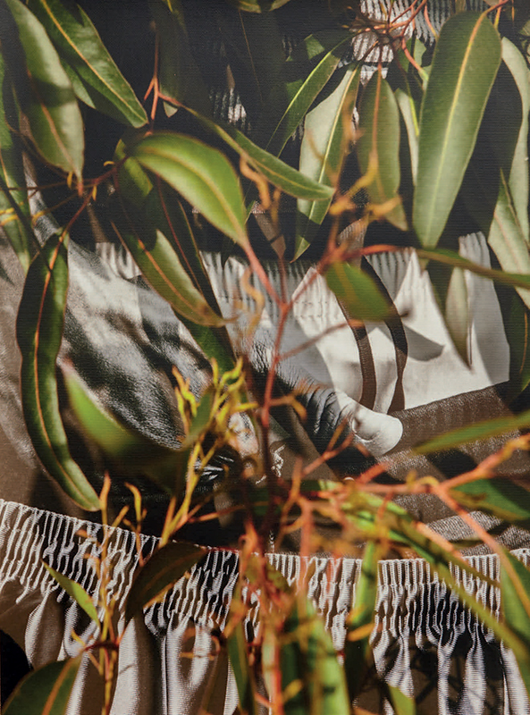
A very different angle on the male form is achieved by David Alekhuogie in his superb photograph rampart police station 34.0567° N 118.2670° W (Fig. 6). The artist provokes us with hints of flesh, a layering of garments, and an identifiably nonwhite hand reaching—in a sexual gesture, or for a weapon, or simply resting? You feel you have a clandestine portal on an illicit act, recalling Marcel Duchamp’s infamous Étant donnés. Taking prints of his images to sites of violence against the Black community, Alekhuogie sets the images within vibrant foliage, creating a layered collision of T-shirts, underwear, and athletic shorts, the natural world, and site-specific violence. Alekhuogie brilliantly evokes two of Robert Mapplethorpe’s most iconic tropes: exaltation of Black male flesh and revelation of flowers, leaves, and stems.
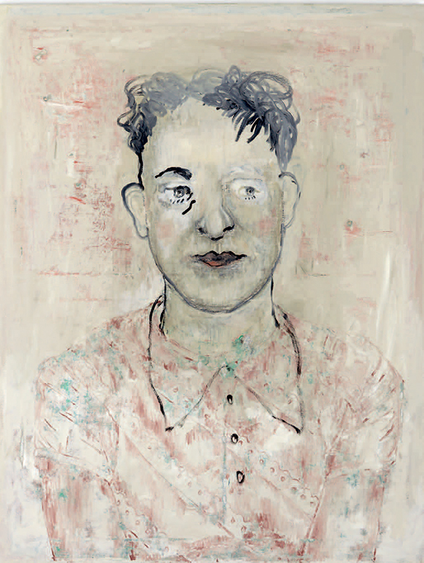
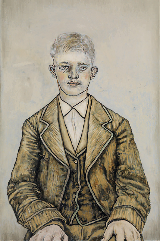
Fig. 13. Boy by van Bart, 2010. Signed, titled, and dated on reverse. Alkyd oil on linen, 47 ¼ by 31 ½ inches. © Hannah van Bart, courtesy of the artist and Marianne Boesky Gallery.
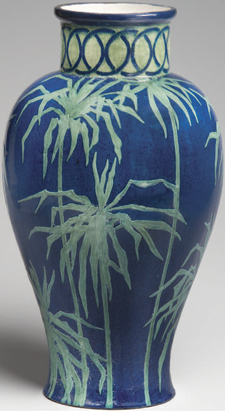
This last effect connects the photograph to a marvelous Newcomb Pottery vase or lamp base with exotic southern vegetation similar to palm fronds (Fig. 5). The rich indigo ground seems cavernously deep, causing the slip decoration in brilliant mint green to hover above with an effect that could be called creepy. The assemblage of stems and finger-like leaves takes on a life of its own, provoking a southern eeriness not unrelated to the uneasy sensibility in the photograph.
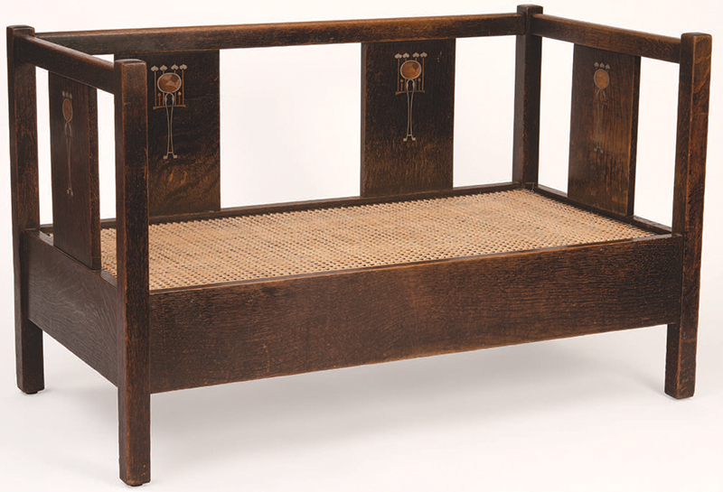
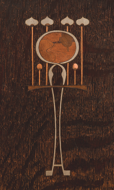
Gustav Stickley made furniture inlaid with fruitwoods, copper, and pewter for just one year around 1903, but this aspect of his work has come to dominate public awareness of his creations. The settle in Figure 8 is an outstanding example of his restrained aesthetic. There is a magical effect achieved by both the geometrically abstracted elements and the medallion set with a bucolic image in various woods depicting a path in a landscape with a tree (Fig. 8a).
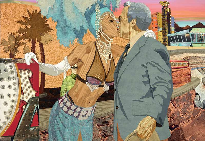
Though it functions rather differently, we enjoy the connection of Stickley inlaid designs to a masterwork by Alison Elizabeth Taylor, The Desert Inn (Fig. 7), wherein complex inlays, including woods and cork, are juxtaposed with an exotic range of painted surfaces and those made from mixed materials not typically associated with traditional marquetry.
Rigorous patterns interpreted in subtle pastels are not typical formats for either painting or ceramics, but two works made eighty years apart unite precision and softness. Hannah van Bart’s paintings are based on generally pre-1970 photo portraits she collects. She imagines relationships with the subjects of these photographs and paints as con- versations and activities play out in her mind. The paintings are rarely authentic renderings of the photographs, and indeed ambiguity is everywhere in her work. In Woman (Fig. 9), we can wonder whether the sitter is male, female, non-binary, or simply non-specifically gendered.
What is sure is that the pattern of the sitter’s shirt is front and center in the composition. Its delicate structure (somewhat intact, somewhat disintegrating) of pinks and greens wonderfully echoes a superb vase decorated with climbing flowers and vines on a lattice by the Overbeck Pottery in Cambridge City, Indiana (Fig. 11). The refinement and intricacy of the Overbeck vase is representative of their finest work, replete with tension between the repeating ornamental motif and its hand-carved rendering and delicate glazing in the peach background, mint-green vines and leaves, and rich salmon-colored blossoms.
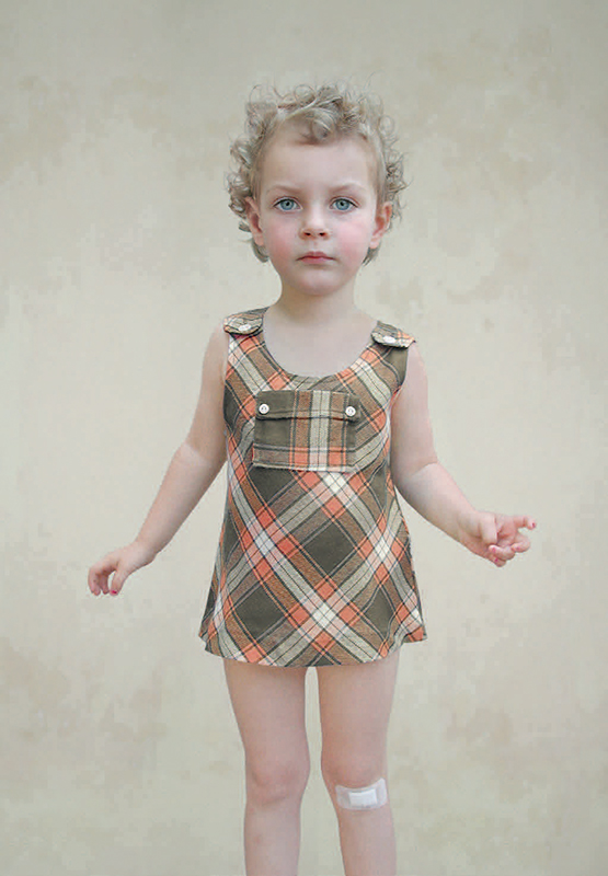
A related struggle exists in Study of a Girl I (Fig. 10) by Loretta Lux, in which the severity of a patterned dress is tempered by the softness of its palette and the disarming spirit who wears it. The effects of the vase, painting, and photograph are connected across the twentieth century in their fascinating use of gentle pastel colors to question the inexorable force of patterned imagery.
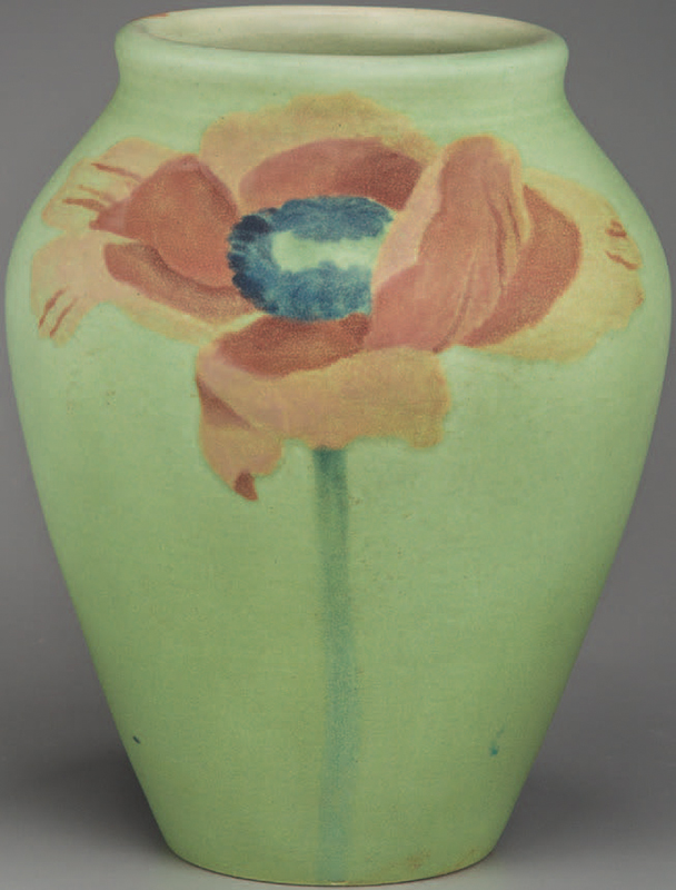
An unexpected synergy between another outstanding painting by Hannah Van Bart and a stellar Newcomb Pottery floral vase emerges from the bold outlining, restrained palette, and audacious composition of both works. The subject of Van Bart’s Boy (Fig. 13) is solid, secure, and calm, but simultaneously leery— weighed down by his oversized vest and jacket, his hands uncomfortably staged on his thighs, and his eyes gazing indeterminably.
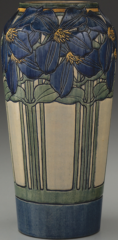
The Newcomb clematis vase on the other hand, is as perfectly resolved as anything made in the early years of that enterprise (Fig. 12). The top-to-bottom integration of every aspect of the decoration is a tour de force of design, but tensions connecting it back to the painting emerge upon closer inspection. The vase is rooted at its base with an ink-like field of indigo above which the openwork stems lead to an explosively exuberant crown of clematis blossoms. The chalky white grounds in both the painting and vase create a void for their subjects, the deeply shadowed textures of van Bart’s boy’s coat mimic the deep carving of the vase and the rich use of brilliant goldenrod hues unites the works across time and place.
Creativity at its limit
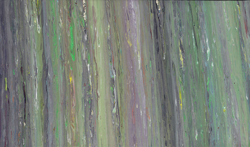
The later drip, smudge, and smear paintings of Larry Poons are iconic among abstract paintings, tracing the boundaries of intention and accident, exquisiteness and vulgarity (Fig. 14). One significant work of Teco, by the Gates Potteries, made around 1900 in the Chicago area, demonstrates a remarkably controlled approach to dripping glaze, rigorously applied in four increments encircling the form (Fig. 15). The structure of this exceedingly rare, molded vase is dramatically forward looking, rivaling the modernism of the Poons painting. But, here, the game is considerably more complex than in Poons’s strategy, where the artist can see, alter, and complete his composition rather straightforwardly. The vase had to be fastidiously glazed, perhaps with formulations perfected in test samples, placed in the kiln, and the result could only be known after the firing. And what a result it was! The glaze drip technique created a nearly perfect pattern of quarter, half, three-quarter, and full drip lengths in the four gaps between the arms of the vase.
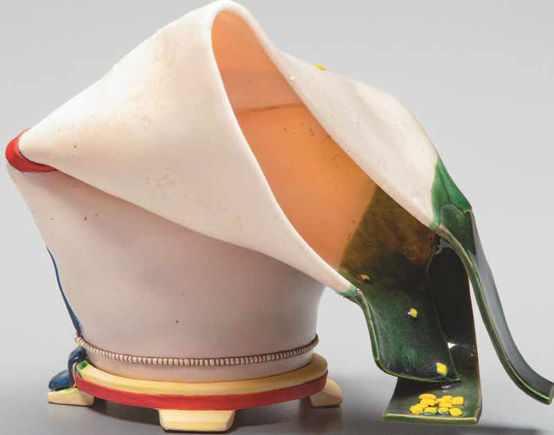
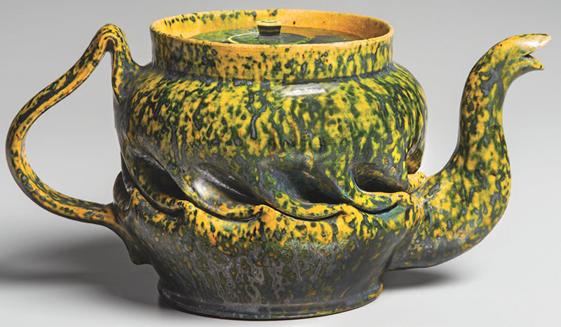
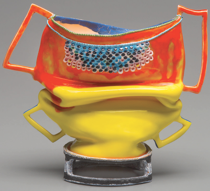
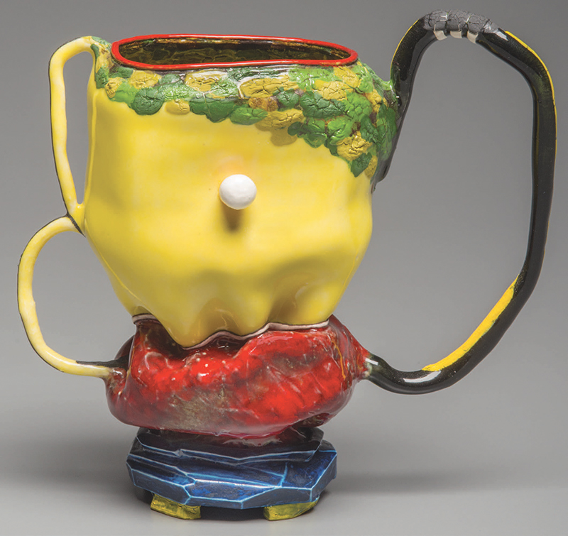
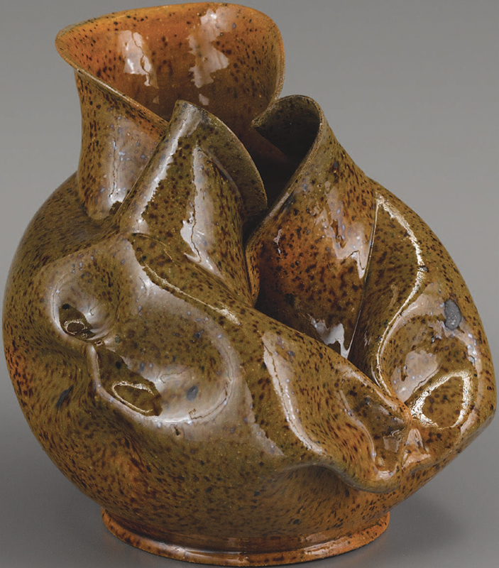
Connections between the radical glazed vessels made around 1900 by George Ohr in Biloxi, Mississippi, and the masterful contemporary art of Kathy Butterly are well established, not in small measure by her own acknowledgement of the same (Figs. 16, 18). Ohr is considered a quintessential American outsider artist, partly because he cultivated a maverick persona, but also because his contorted shapes, inventive handles and experimental glazes challenged the very boundaries of art pottery in the early twentieth century (Figs. 17, 21–23). Similarly, Butterly’s imaginative creations defy easy categorization (Fig. 19). Surely her sculptures continue experiments born in the work of Ron Nagle and Ken Price, but her flirtations with a wide spectrum of expression from intentionally uncomfortable to downright beautiful transcend those artists and others of her generation (Fig. 20). Specific comparisons are apparent as between vessel shapes and structures, whimsical handles, and the complex and layered folding of clay bodies, but the most compelling link across decades of creation is the willingness of Ohr and Butterly to test the meaning and viability of beauty against their subversive expressions of the sublime.
The works of fine art and design presented here reside in one place, at one time, but taken together they provoke consideration of many times and many places. Living with art and design is always an adventure wherein connections lead to rumination, divergences pose useful questions, and the viewer is engaged constantly looking for what Gertrude Stein called the “prick of genius.” Building and living with two completely discrete collections of this type is a challenge, but the rewards expand our understanding of each discipline much as The Magazine ANTIQUES has done now for one hundred years!
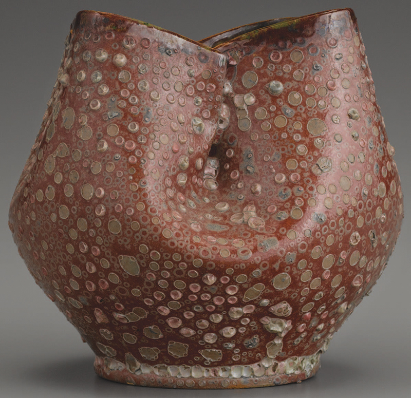
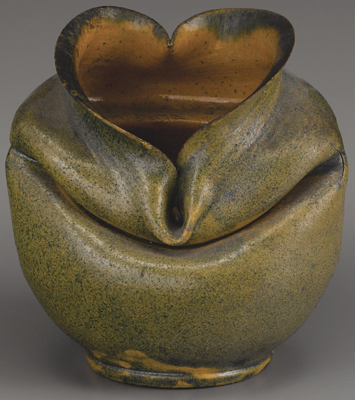
Fig. 23. Crumpled vase by Ohr, Biloxi, c. 1897–1900. Impressed “G.E. OHR, Biloxi, Miss.” Height 6 inches.