
When thinking about bringing together art and design across a century, there are no better exemplars than the divine union of late nineteenth- and early twentieth-century decorative arts and postwar paintings and sculptures in the collection that Sydney and Frances Lewis donated to the Virginia Museum of Fine Arts. Suffice it to say that there are few museum experiences more remarkable than the exhibition of the fruits of their collecting of art and design.
Here, we return to analyzing how juxtapositions of art and design across time and place can inform our understanding of both disciplines.
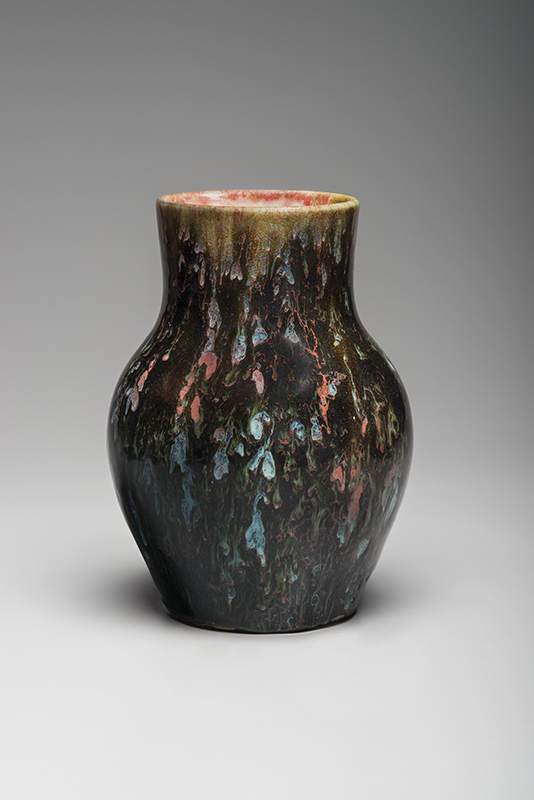
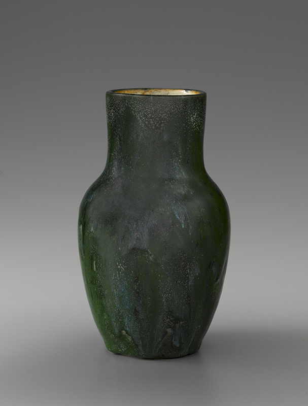
Fig. 3. Vase with flambe glazes by Hugh Robertson (1844–1908), Dedham Pottery, Massachusetts, c. 1896–1908. Tooled “Dedham Pottery/ HR.” Unless noted, all ceramic works are made of glazed earthenware and are marked on the underside. Height 8 ¾ inches. 
Fig. 4. Small scenic bowl or vase by Frederick Hurten Rhead (1880–1942), Jervis Pottery, Oyster Bay, New York, c. 1908–1909. Tooled “Briarcliff ” and “Jervis” in octagon. Height 4 inches.
Flowers, fireworks, land, and sea
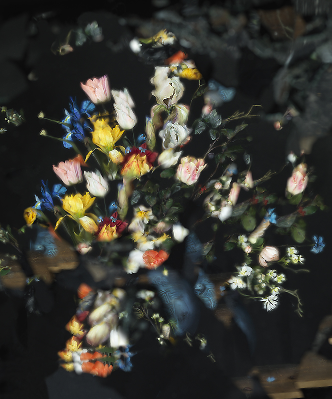
Ori Gersht is highly regarded for his extraordinary photographs of exploding floral bouquets, which subvert traditions of northern European still life painting and thereby bring into question traditional modes of art historical analysis. The photograph On Reflection, Virtual B01 (Fig. 1) is among his most effective compositions in this series, with just the right blend of identifiable aspects and those that fade toward indecipherability. Though the Massachusetts potter Hugh Robertson’s late nineteenth-century flirtations with fireworks imagery in a masterful vase (Fig. 3) might immediately call to mind the more contemporaneous Nocturnes of James Abbott McNeill Whistler, in our collection his exploding bursts of teal, crimson, and green conjure Gersht’s masterful photograph.
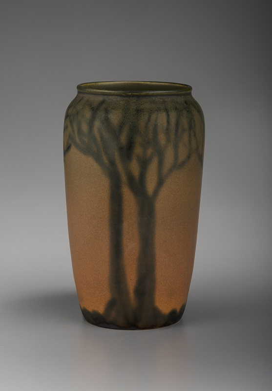
Fig. 6. Scenic vase by Flora Cable Huckfield (active c. 1924–1930), North Dakota School of Mines Pottery, Rapid City, c. 1924–1930. Printed with round university seal in cobalt blue: “UNIVERSITY OF NORTH DAKOTA/ GRAND FORKS, N.D./ MADE AT/ SCHOOL OF MINES/ N.D. CLAY”; tooled “H” in circle for Huckfield. Height 8 ¼ inches. 
Fig. 7. Tall scenic vase by Huckfield and possibly Louise Thorne (active c. 1918–1923), North Dakota School of Mines Pottery, c. 1923– 1930. Printed with round university seal in cobalt blue: “UNIVERSITY OF NORTH DAKOTA/ GRANDFORKS, N.D./ MADE AT/ SCHOOL OF MINES/ N.D. CLAY and tooled “Roros(?)/ Huckfield-948/ (S)/ Thorne.” Height 11 ½ inches.
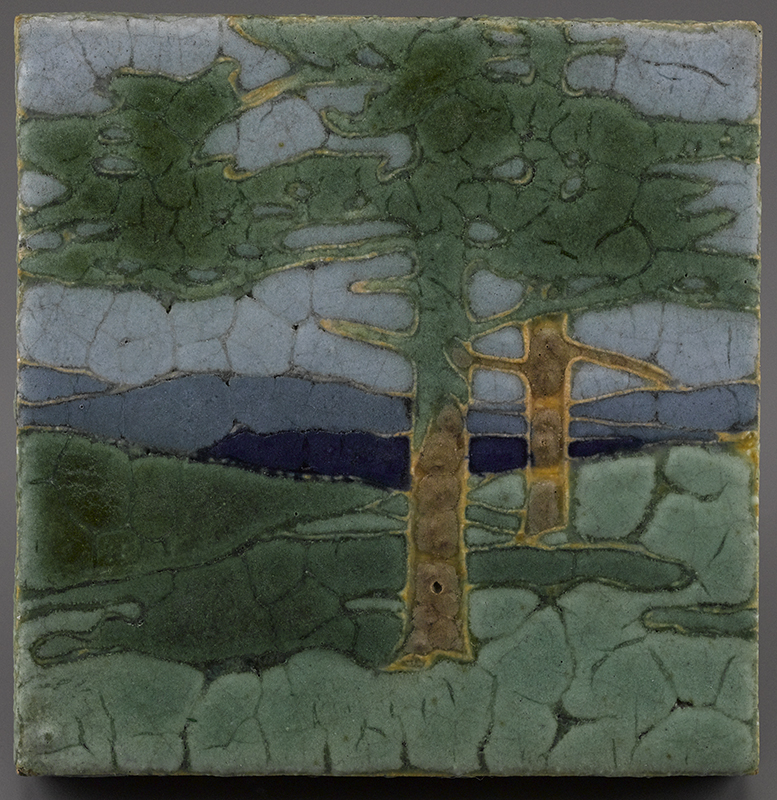
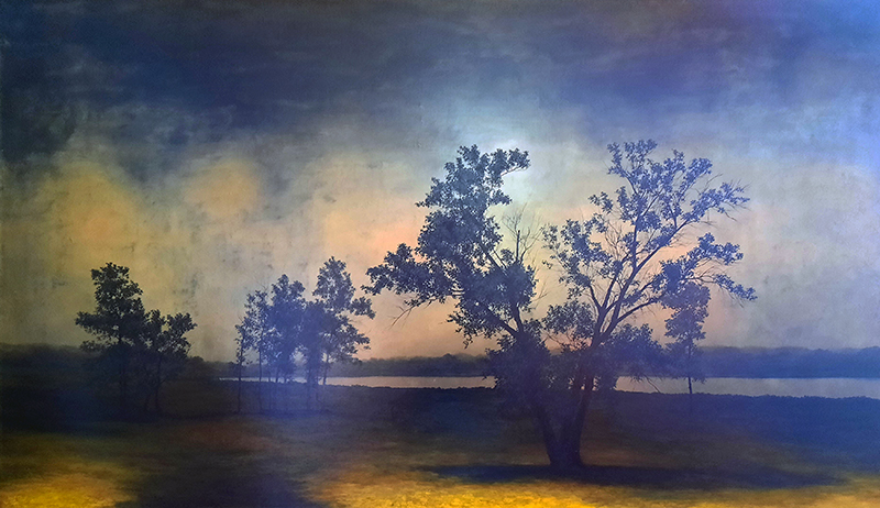
David Klamen has created a unique body of landscape paintings based on memory that evoke real places through the blurry lens of recollection (Fig. 5). Resonances with this type of tableau are rife in faience and pottery of around 1900. Grueby Faience and Pottery (as the company, which went by several names during the course of its history, is commonly known among collectors) of Boston explored a wide array of similarly melancholic montages (Fig. 2). Frederick Hurten Rhead conveyed this sensibility in a small monochromatic blue-gray composition made at the Jervis Pottery in Oyster Bay, New York (Fig. 4). Another single-color presentation was rendered by the North Dakota School of Mines Pottery in a dramatic composition of trees with hills in the distance (Fig. 7). Rookwood Pottery achieved a comparably adroit handling of light, shadow, and perspective in one of its finest matte-glaze landscape vases (Fig. 8), but it is the North Dakota School of Mines Pottery that created a vase with just the right glow of illumination to evoke the twilight of memory (Fig. 6)—a perfect complement to Klamen’s sense of eerie beauty.
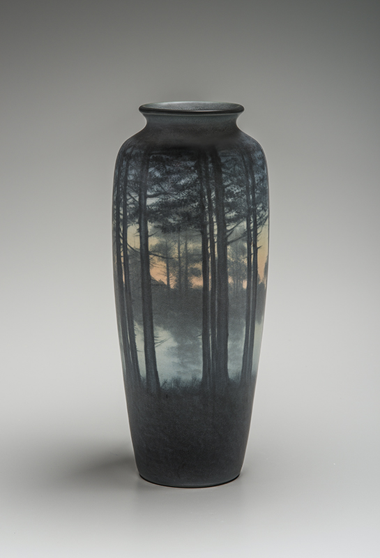
Fig. 8. Scenic vase by Edward Timothy Hurley (1869–1950), Rookwood Pottery, Cincinnati, 1910. Impressed with the pottery’s “RP” monogram within flames mark, “904B” (model), and “V” (vellum finish); tooled “ETH” in monogram for Hurley. Height 14 ¼ inches. 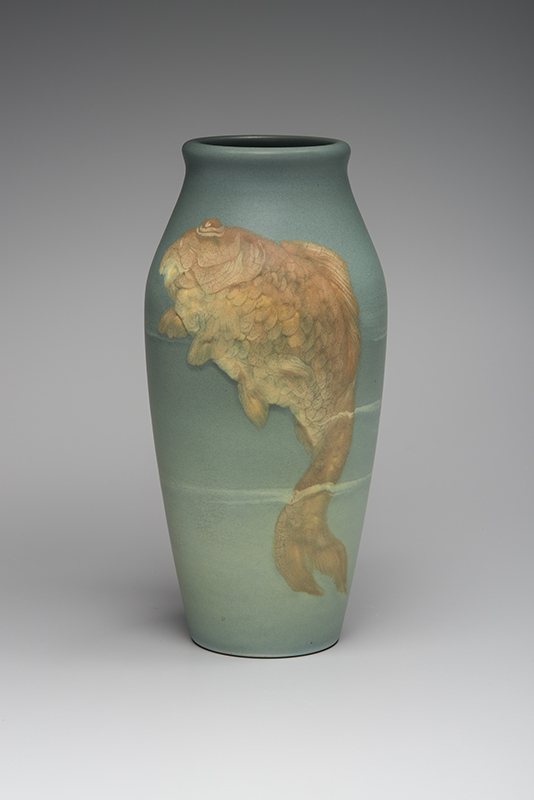
Fig. 9. Vase with goldfish decoration by Albert R. Valentien (1862– 1925), Rookwood Pottery, 1901. Impressed with the pottery’s “RP” monogram within flames mark, “192B” (model), and “Z” (matte glaze finish); painted “A. R. Valentien.” Height 13 ½ inches.
Turning from landscape to seascape, the painting Phantom by William Baziotes (Fig. 10) presents aquatic themes in a considerably more abstracted way than Rookwood’s well-known presentations of fish. Still, there is a fascinating connection to Rookwood’s vase with massive and exquisitely detailed carp surging upward through veils of water (Fig. 9).
Perhaps somewhere between the two approaches, Samuel Russell Gerry Crook depicts stylized fishes and fishing lures boldly outlined in black on a tapering vase dominated by richly suffused azure waters (Fig. 11). The undulations of color and texture in Phantom recall the glazing of the carp’s body, but it is the archaic rendering of the fishes nearly hooked that returns us to the painting and the mysteries of the deep.
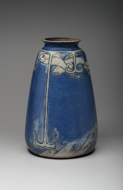
Fig. 11. Vase with fish and lures by Samuel Russell Gerry Crook (1869–1955), Lincoln, Massachusetts, c. 1906–1920. Unmarked. Height 11 ¾ inches. 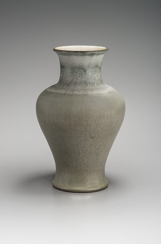
Fig. 13. Baluster vase by Charles Fergus Binns (1857–1934), Alfred, New York, 1915. Tooled “CFB” in monogram and “1915.” Height 12 inches.
Color is never just color
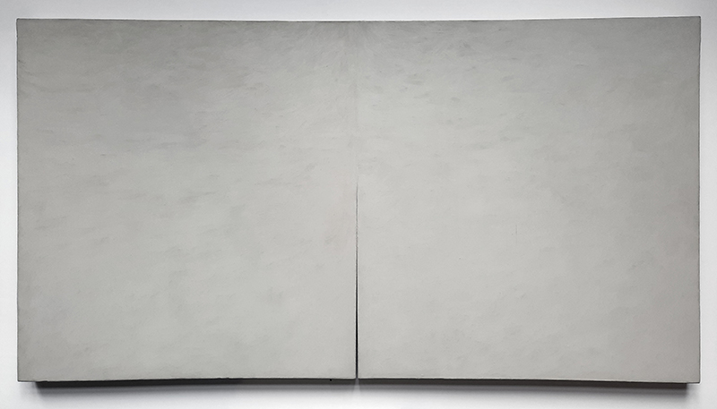
Gray is a complex affair, whether in glaze or paint and whether it is 1915 or 1990. Few ceramists in the early part of the twentieth century succeeded in bringing forth the delicate, elusive wonder of gray like Charles Fergus Binns. He experimented widely with glaze formulations and kiln temperatures to perfect the sublime viscous matte glaze seen on a baluster shape vase (Fig. 13) that harkens directly to traditional Asian ceramic forms. Binns achieves aspects of the effect with frothy white and microcrystalline green counter-glazes, but the experience of the work is really predicated on the perfectly flat but subtly variegated gray that covers most of the surface.
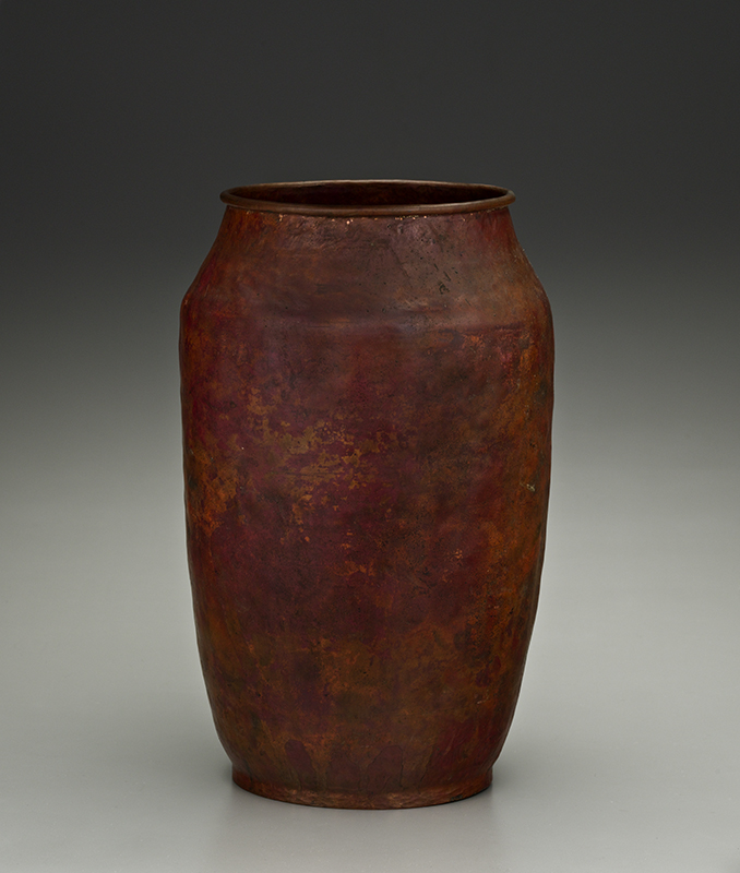
Fig. 14. Large vase by Elizabeth Eleanor D’Arcy Gaw (1868–1944) and Dirk Koperlager van Erp (1860–1933), San Francisco, c. 1910. Impressed with the firm’s windmill emblem, “Dirk van Erp,” and remnant of “D’Arcy Gaw” mark. Patinated copper; height 15 ¾ inches. 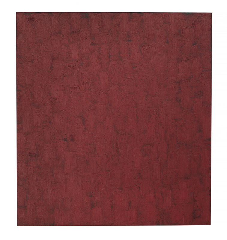
Fig. 15. Untitled, 391, by Peter Tollens (1954–), 2001. Inscribed “391 2001 Aug. OKT. 2001 Peter Tollens” on the back. Oil and tempera on wood panel, 22 1/2 by 20 1/2 inches. Courtesy of the artist.
The jarringly minimalist effect of the gray body contrasted with the neck presents an interrogation of relational aspects present in a painting made early in the career of the celebrated contemporary artist Tim Hawkinson. As with the glazed vase’s gently divided surface, Hawkinson’s Untitled (Warm and cool semi diptych) (Fig. 12) features a cut in the large gray rectangle that suggests bifurcation, but leaves some of the canvas intact—questioning the very notion of what constitutes a diptych. The skin of the painting is complexly variegated with wisping brushwork across the whole composition, but the two sides are set in contrast by faint yellows on the left, and chalky blue-whites on the right. The juxtaposition of these two works, made seventy-five years apart, offers a window into the world of grayness and its many discontents.
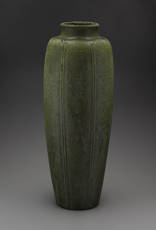
Fig. 16. Massive floor vase by Ruth Erickson (b. 1883), Grueby Pottery, Boston, c. 1900. Tooled “R-E” in monogram; impressed “GRUEBY POTTERY BOSTON USA” in a circle with lotus blossom emblem in center. Height 33 ¾ inches. 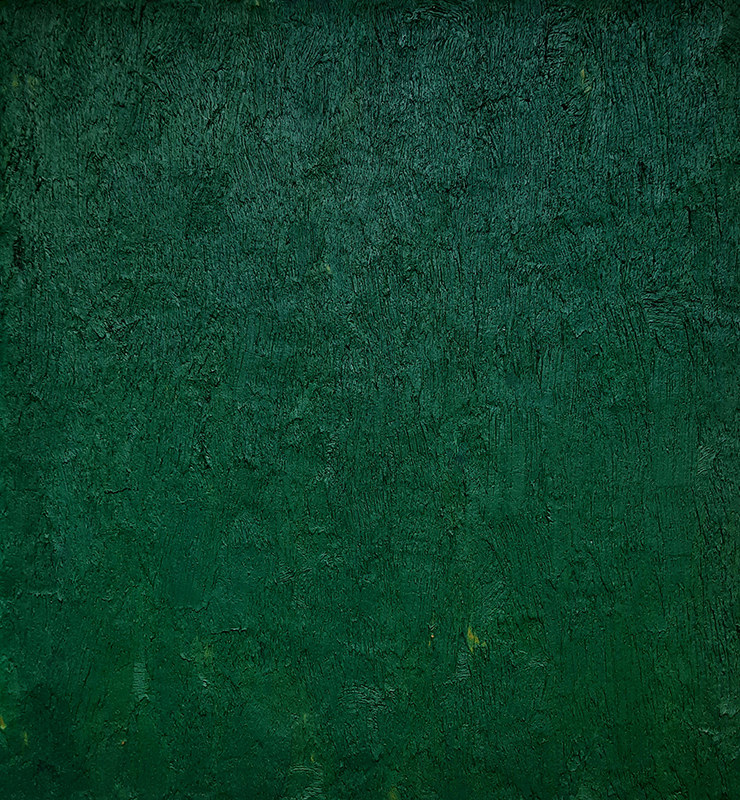
Fig. 17. Untitled, 144, by Tollens, 1992. Signed, numbered, and dated on the back. Oil on linen, 28 by 24 inches. Courtesy of the artist.
Paintings by Peter Tollens are manifestations of pure color and robust textures and the interaction of hue and surface. His green untitled painting in Figure 17 resonates deeply with the rich cavernous hues of works by Grueby (Fig. 16). Both succeed because of the essential connection of color and surface.
Fig. 18. Untitled (30-06-32-28) by Michael Toenges (1952–), 2006. Signed and numbered on the back. Oil on wooden multilayered board, 12 ¾ by 11 inches. Courtesy of the artist. 
Fig. 20. Untitled (36-04-32-28) by Toenges, 2004. Signed and numbered on the back. Oil on wooden multilayered board, 12 ¾ by 11 inches. Courtesy of the artist.
Similarly, Tollens’s brilliant scarlet painting (Fig. 15) evokes the fire-engine red of one of California metalworker Dirk van Erp’s largest and best-preserved patinated-red copper vases. This massive vessel with a hand-rolled rim (Fig. 14) was created by van Erp’s best designer and maker, D’Arcy Gaw, and was likely patinated in brilliant red after she resigned her position in January 1911. In both painted form and patinated copper, the interplay of evocative red hues and the textures that suspend them in undulating variation link these powerful works across a ninety-year gap.
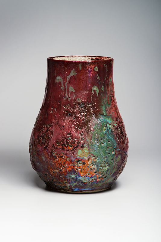
Aspects of contemporary abstract painting dovetail nicely with turn-of-the-century ceramic works by Hugh Robertson at the Dedham Pottery. Born into a family of ceramists, Robertson was an integral part of the Boston area arts and crafts movement and, after perfecting a version of the Chinese sang de boeuf glaze, he devoted himself to radical experiments featuring brilliant colors, complex textures, and glass-like surfaces (Fig. 19). His vases function as backdrops for glaze investigations that range from vivid hues and iridescence to viscous, globular, and frothy textures (Figs. 21, 23, 25). There is an intrepid handling of intentional glazing paired with what Helen Frankenthaler called “happy accidents,” and in the balance between the two is the genius of Hugh Robertson.
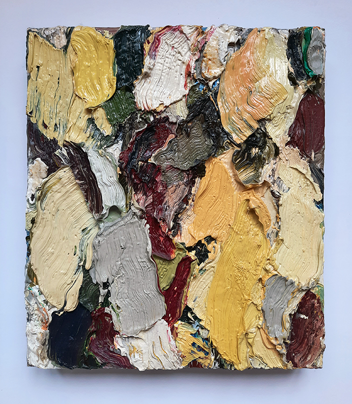
Fig. 22. Untitled (14-05-40-35) by Toenges, 2005. Signed and numbered on the back. Oil on canvas, 15 ¾ by 13 ¾ inches. Courtesy of the artist. 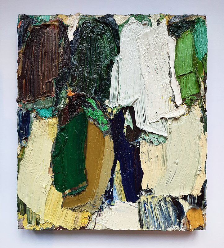
Fig. 24. Untitled (02-04-40-35) by Toenges, 2004. Signed and numbered on the back. Oil on canvas, 15 ¾ by 13 ¾ inches. Courtesy of the artist.
Michael Toenges works in a rather different way, but the effects are related. Trained as a graphic designer, the painter often uses a grid below the surface of his abstractions along with a base layer of messily applied mounds of paint that form the topography upon which to layer the “skin”—the finished surface. Toenges paints into the crevices, across the peaks and around the valleys, solving visual problems as he goes, and the resulting compositions retain just the right amount of haphazard spontaneity as the Robertson vases (Figs. 18, 20, 22, 24).
One last Dedham Pottery vase (Fig. 26) resounds with a contemporary painting by Teo González (Fig. 27). Robertson achieves a wildly robust texture of nearhoneycomb dimpling that performs in three dimensions what González’s painting achieves through virtuosic dripping of emulsion into a gridded field.
Tears in the fabric of the continuum
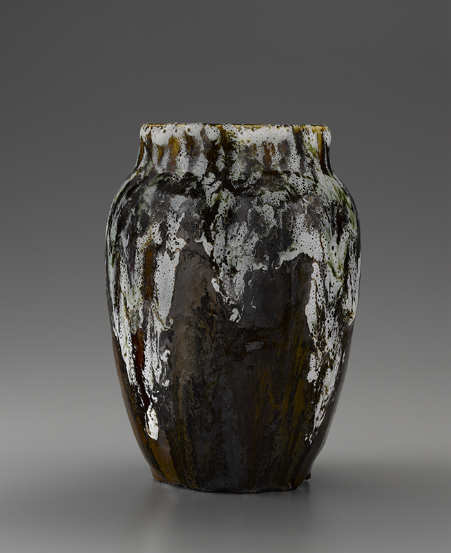
Fig. 25. Vase with volcanic glaze by Robertson, Dedham Pottery, c. 1896– 1908. Tooled “Dedham Pottery/ HR.” Height 9 ½ inches. 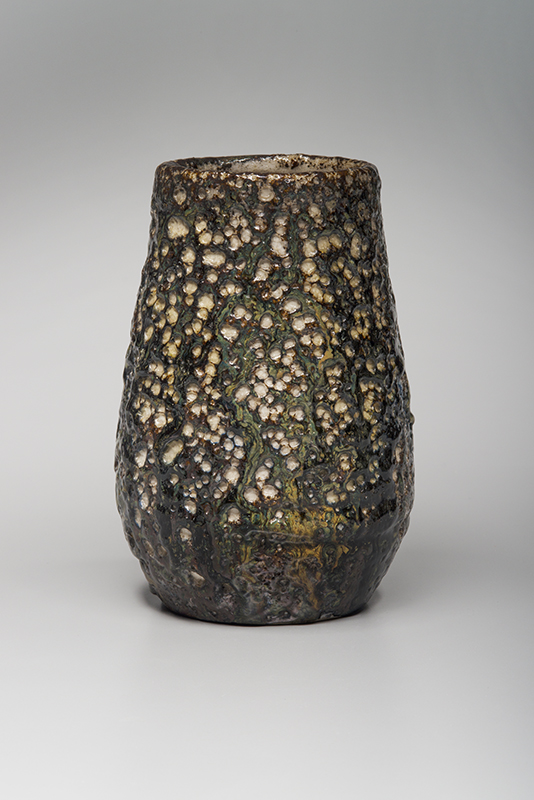
Fig. 26. Vase with volcanic glazes by Robertson, Dedham Pottery, c. 1896–1908. Tooled “Dedham Pottery/ HR” and painted “DP68D.” Height 7 ¼ inches.
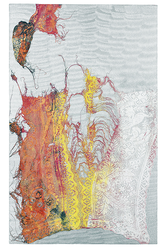
Fissure and tearing are central themes in recent contemporary art, and few have applied these concepts more effectively than painter Mark Flood. His works often feature luminously colored and textured backgrounds invaded by torn fabric imagery. Roadkill (Fig. 28) is an exceptional example of this technique, featuring a scalloped silver metallic background with torn lace painted in shades ranging from brilliant orange to white.
It might seem odd to compare this work with a Roblin Pottery vase created by Linna Irelan and Alexander Robertson, the brother of Hugh Robertson (Fig. 29). Alexander and Irelan founded the short-lived Roblin Pottery in San Francisco in 1898, and Irelan was without question its finest designer and maker. The remarkable modernity of the vase lies in the decision to apply an entirely idyllic leafing vine ornament against a “canvas” of a dramatically torn form, where part of the rim folds gently forward, the rest coiling up in a spiral. The boldness of the ripped clay, foiled by the delicacy of the garland (which tucks into the crevice), forecasts the same deft union of audacious composition and the intricacy of lace in Flood’s painting.
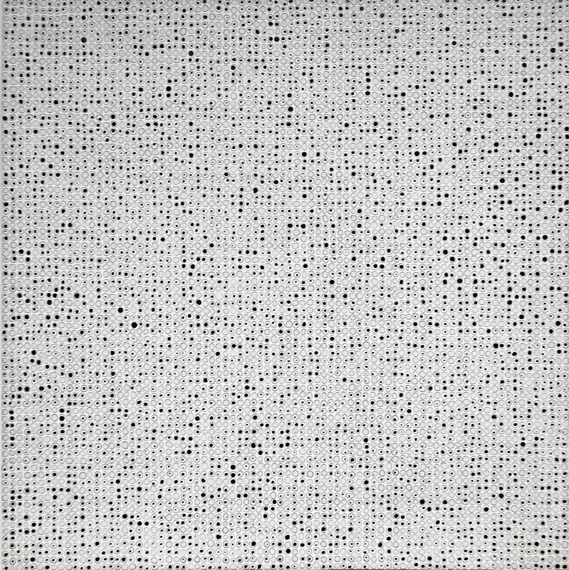
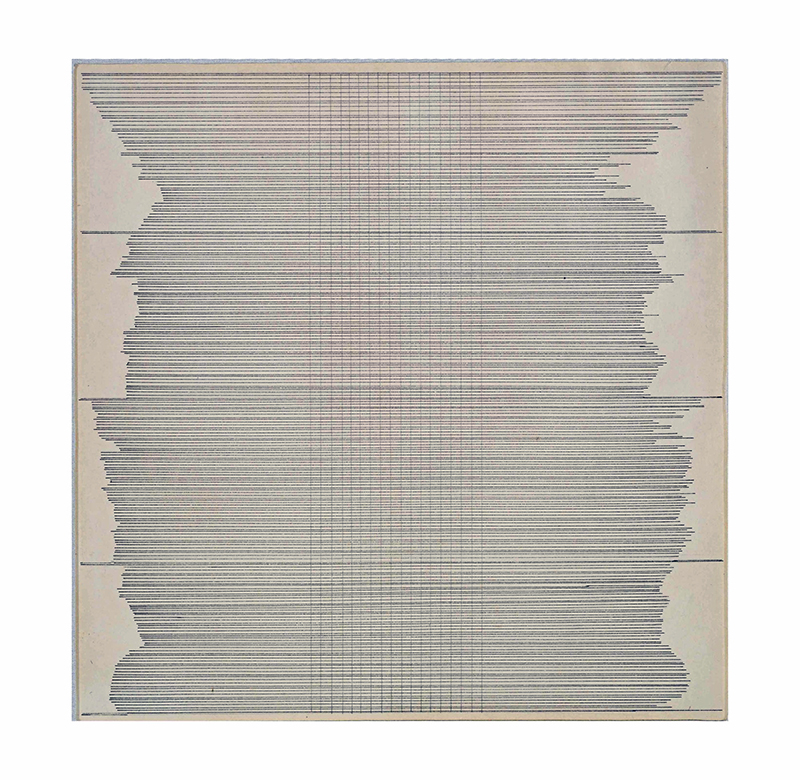
Hand-rendered patterns and their subtle disruptions are one of the central themes of the art of Agnes Martin. A brilliant drawing she made in 1960 trembles with latent energy. Hundreds of densely packed horizontal lines collide with a series of verticals near the center (Fig. 30). Tensions between the verticals and the delicate cells created by intersecting lines convey a sense of conflict between precision and wildness.
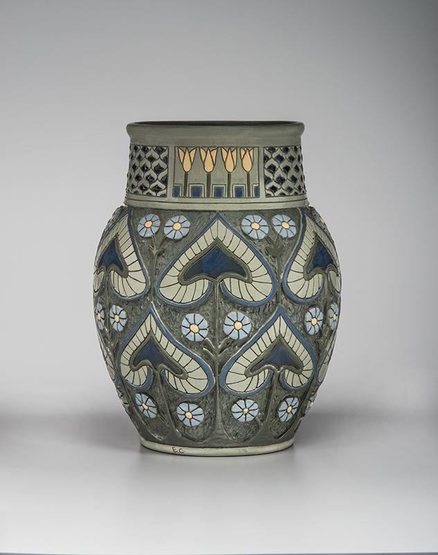
Perhaps nowhere in design from around 1900 was a more penetrating exploration of just this principle realized than in the work of the Overbeck Pottery. An almost wallpaper-like, two-dimensional graphic regularity informs the Overbeck vase in carved and glazed earthenware shown in Figure 34. But the effect is neither flat nor bland. The scraped patterns in the clay leave traces of the artist’s hand, just as irregularities in Martin’s lines prove her authorship rather than that of a machine. Exquisitely subtle glazes heighten the effect, where a watery blue field is interrupted by vertical climbs of alternating leaves and dramatically plum-hued blossoms. Much like the registration lines and continually varying lengths of all the gestures, the decision to extend the leaves and blossoms at the top of the vase up onto the collar band is thrilling, jostling the viewer’s expectations of regularity and giving an asymmetric energy to the work that rivals the masterful composition of the drawing.
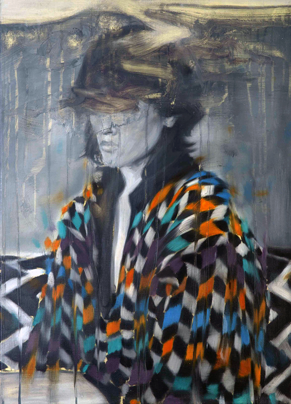
Breakdowns in patterned imagery play an essential role in Tom Gidley’s Edge Array (Fig. 32), where not only is the whole image dissolving, but simultaneously the background patterns and the subject’s shawl begin to lose the integrity of their geometries.
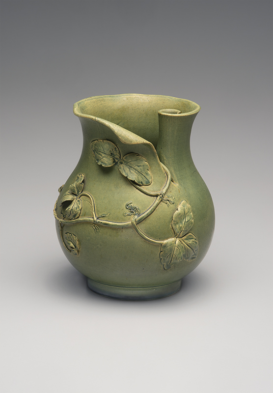
The subtle variations in hand-carved clay vases designed and produced by Frederick Hurten Rhead at the Roseville Pottery in Ohio around 1900 reflect less-fractured imagery but convey the same interactions of regular versus divergent aspects (Figs. 31, 33). Patterns are questioned by slight asymmetries where conventionalized hand-carved leaves and flowers belie the decorative scheme. And just the way these anomalies give pulse to the Martin drawing, they unfurl across the surface of the vases, causing the eye to pause and to wonder: what is repetition; what is variation?
As we all celebrate the one hundredth anniversary of the founding of The Magazine ANTIQUES in the context of an increasingly complex world, it seems more valuable than ever to open our purview to new and meaningful unions between art and design, while heeding artist Richard Tuttle’s advice: “Let enlightenment fall where it may.”
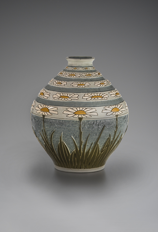
Fig. 33. Vase with stylized daisies by Rhead, Roseville Pottery, 1904–1908. Partial original Roseville “Rozane/ Ware” pottery line label. Height 8 ¼ inches. 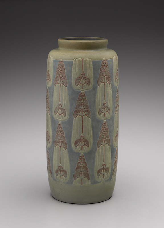
Fig. 34. Vase modeled by Elizabeth Gray Overbeck (1875–1936) and decorated by Mary Frances Overbeck (1878–1955), Overbeck Pottery, Cambridge City, Indiana, c. 1915. Impressed with the pottery’s “OBK” mark in monogram and “E” and “F” (for the modeler and decorator, respectively). Height 13 1/2 inches.