
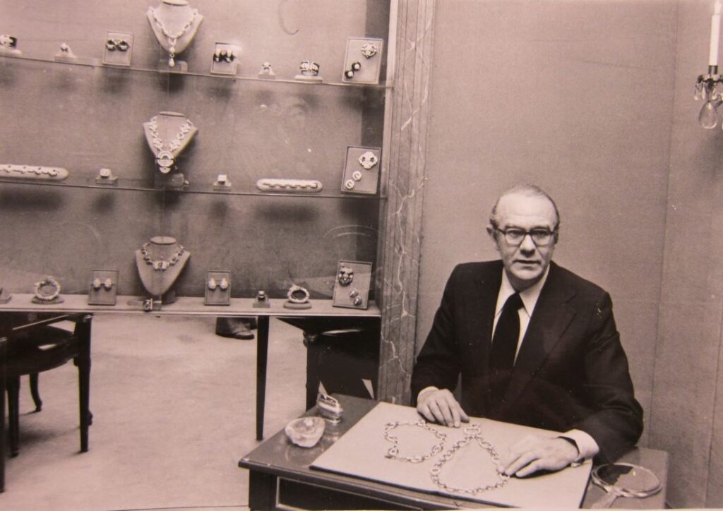
When David Webb arrived in New York from the small town of Asheville, North Carolina, in the mid-1940s, he was seventeen and penniless. He hadn’t come from the refined worlds that nurtured Fulco di Verdura in Italy or Jean Schlumberger in France, men who became his peers and competitors; unlike them, he did not have a social set at his beck and call, or a wardrobe of bespoke suits. Even though he dreamt of becoming a jeweler, he’d only briefly apprenticed as a boy in the town’s local jewelry shop run by an uncle. There he made dogwood pins and copper ashtrays, with the insignia of a spider’s web on the underside, a little wink to his surname. The teenager from Appalachia found in Manhattan, newly surging after the war, his mecca and his muse.
For this young dreamer, the art and architecture of New York beckoned. His first job, in the Diamond District, was around the corner from Times Square and Broadway. Almost immediately, he made a practice of going to art galleries, or to Fourth Avenue, a haven of used bookstores and antiques shops, where he began collecting art books and Chinese decorative arts. It was this act of looking, initially at pretty much everything, that trained his thinking about what jewelry could be. By far his favorite haunt was the Metropolitan Museum of Art, which became a weekly excursion and gave him a feeling for ancient art. “Jewelry and objects of art four thousand years old,” Webb said, “are newer than anything we have today.”
In 1948, just four years after arriving in New York, Webb opened his first shop. It was a third-floor walkup and hardly fancy, but soon thereafter he had garnered a following among the ladies-who-lunch. The New Yorker—never frivolous in its praise—anointed him “a creative meteor.” By the 1960s Webb’s work had achieved a cultlike status. What most distinguished it was design, an informed eye, and excellent craftsmanship. As he once declared, “I believe the things I make have museum quality.” In August 1963, in an article for the New York Herald Tribune titled “Why Not Hang Gems?” he called on museums to recognize jewelry as art. “Perhaps,” he wrote, “our museums could establish permanent collections” of jewelry.
My new book, The Art of David Webb: Jewelry and Culture, takes its cue from Webb’s belief that jewelry is a form of art—one that deserves respect and recognition and to be housed in the very museums he cherished. The pairings that follow, three of the scores featured in the new book, juxtapose Webb jewelry with artworks in different mediums found in the collections of museums. These combinations demonstrate where, in many cases, Webb found inspiration and—more importantly—bear out his convictions on the aesthetic and cultural affinities between jewelry and other forms of art.
A Navajo necklace re-imagined
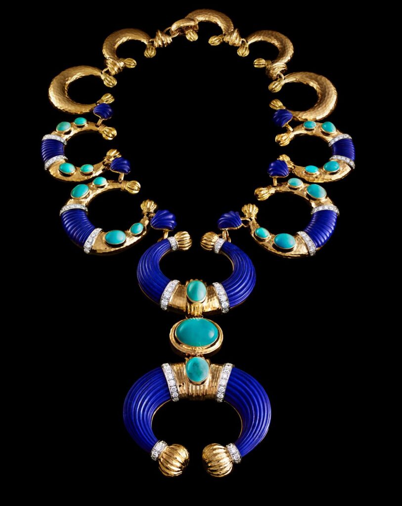
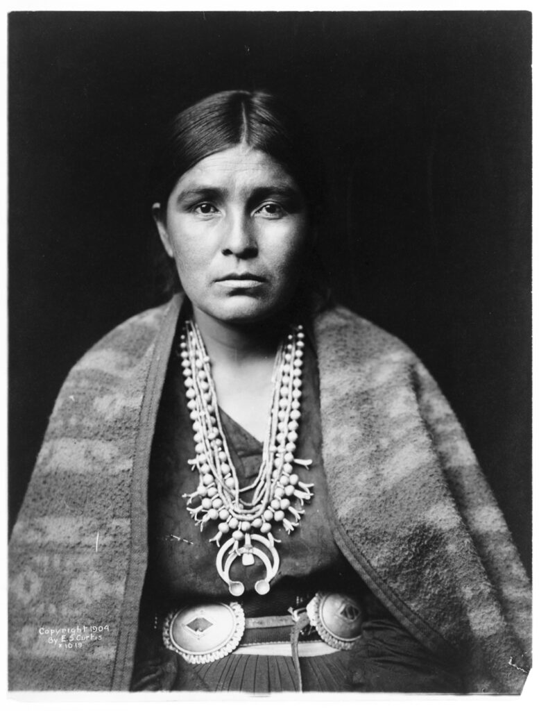
The bohemian culture of the 1970s embraced jewelry that was more soulful and “meaningful.” With this in mind, David Webb considered the silver squash blossom necklace, a design credited to the Navajos, from around the end of the nineteenth century. In keeping with his tendency to adapt styles from other cultures and times, Webb put his own spin on the design: instead of the traditional squash blossom petals, he used one single element, the naja, or crescent shape, at every point of the hammered gold necklace and for the pendant base.
It was through the tireless work of the great pictorialist photographer Edward Curtis that we know how many Native American tribes lived. His pioneering work, the twenty-volume North American Indian, published 1907–1930, with a foreword by Theodore Roosevelt, remains the most thorough presentation of Native Americans in the country. Curtis, nicknamed “Shadow Catcher” by the Native Americans, humbly described the approach to his lifelong work saying, “We, not you. In other words, I worked with them, not at them.” The young woman Curtis photographed would have been among the first to have so special a necklace at this time.
Art trends translated
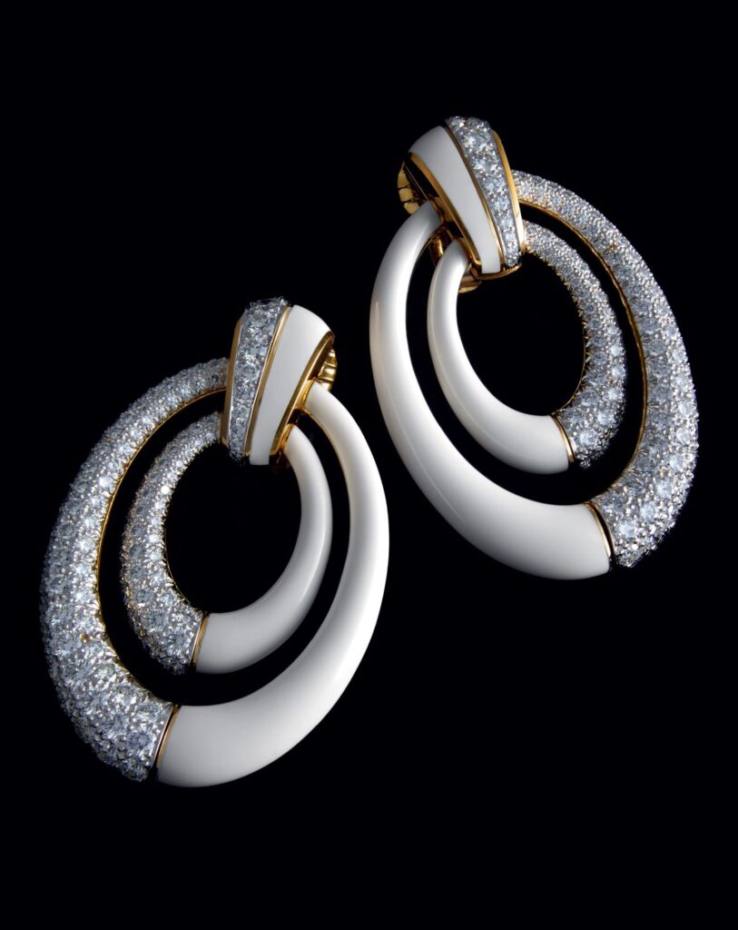
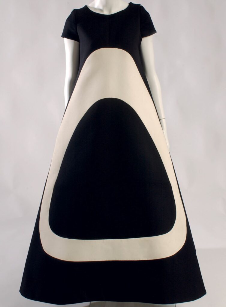
Just as David Webb riffed on art deco, so too other art styles have influenced the house—in this case 1960s Op Art. There is the deco fin motif of the earring top and the freely swinging double hoops, half diamond, half white enamel, suggest Op Art. Just as declarative is this Op Art–inspired black and white silk dress from the couture maison Jean Patou. The white ovoid shape, inset on both front and back, mimes the overall silhouette of the dress. The contrasting graphics of the earrings and dress engage with leading Op Art works from the period, such as those by Bridget Riley and Victor Vasarely. When positive/negative geometries are applied to adornment, the meaning of art is inextricably broadened.
A Japanese print suggests a floral brooch
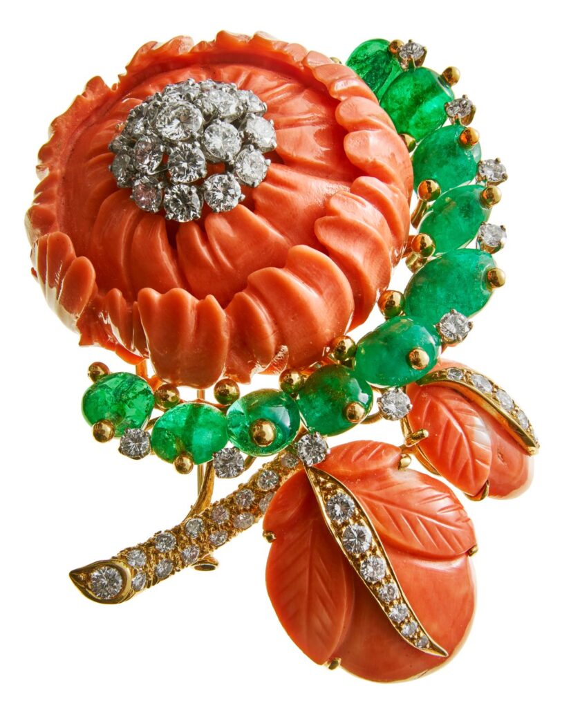
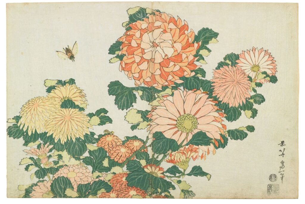
The carving of this brooch is exquisite: confident and assured without the slightest wiggle room for a nick or crack in the many-petaled chrysanthemum, nature’s floral harbinger of autumn. What makes it so David Webb is its magnificent size and the luscious, heavy blossom.
The delicacy of this floral scene by Hokusai the artist belies the bohemian, wild streak that was Hokusai the man. On the one hand, he was a gifted artist of the Edo period—a master of ukiyo-e, a style of Japanese genre painting depicting the pleasures of daily life, including restful landscape views, that were produced as affordable woodblock prints. But Hokusai was also known for his eccentricities, beginning with his name, one of thirty pseudonyms he chose for himself, usually relative to whatever style of art he was making at the time. (By most accounts, he also had more than ninety residences.) This self-critical artist declared that his best work began in his seventh decade, writing, “nothing I did before the age of seventy was worthy of attention. At seventy-three, I began to grasp the structures of birds and beasts, insects, and fish, and of the way plants grow.” That is also the period when he made this chrysanthemum print.
Excerpts in this article are adapted from The Art of David Webb: Jewelry and Culture published by Rizzoli (New York, 2023)